

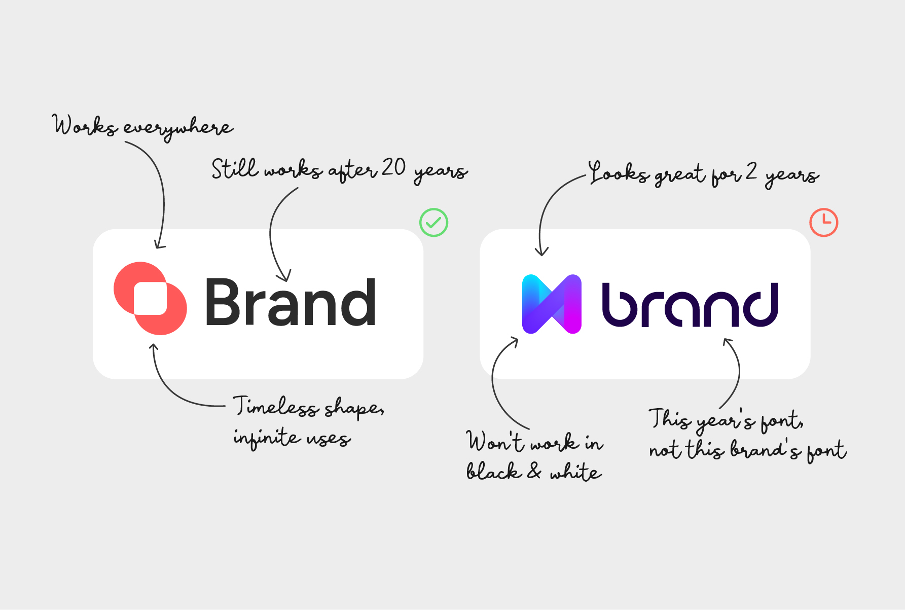
Not every business needs the same kind of logo. A fast-fashion label chasing this season’s aesthetic and a law firm building fifty years of client trust are solving completely different problems, and the right logo for each one looks nothing alike.
The real question isn’t “which style is better.” It’s: what is this brand actually trying to do, and which approach, timeless or trend-based, gets it there? See how that plays out in real client work →
Two Different Design Goals
Trend-based design borrows whatever look is dominating design feeds right now: gradients, a specific rounded sans-serif, a particular icon style. It’s built to feel current, and for the right brand, that’s exactly the point. A startup trying to look fresh and modern, a seasonal campaign, an app targeting a younger audience-these can genuinely benefit from a logo that feels of the moment, even knowing it may need a refresh in a few years.
Timeless design is built from the brand’s audience, industry, and long-term identity, independent of what’s fashionable this year. It costs more upfront thinking but far less over time, because it isn’t tied to a design era that will eventually pass. This is usually the right call for brands planning to build recognition over a decade or more, professional services, legacy businesses, anything meant to be instantly recognizable years from now without a redesign.
Neither approach is a mistake. The mistake is picking one without knowing which goal you’re actually optimizing for.
Why Simple, Unchanged Logos Tend to Last
Some of the most recognized logos in the world make the timeless case clearly.
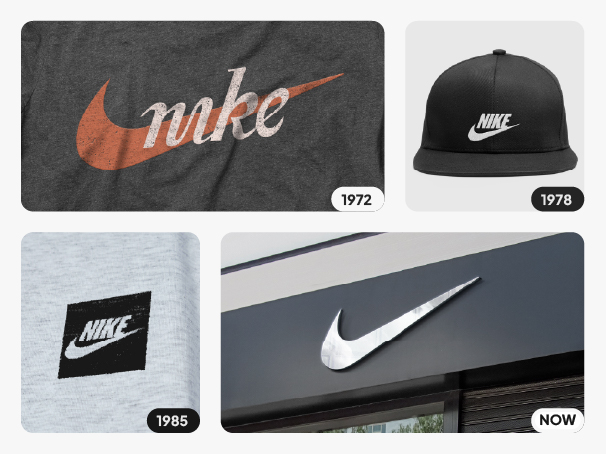
Nike’s Swoosh has stayed essentially untouched since it was created in 1971. It doesn’t spell out “Nike,” doesn’t depend on a specific color, and isn’t tied to any visual trend, which is exactly why it hasn’t needed to change across five decades of shifting design fashion.
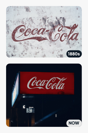
Coca-Cola’s script logo dates back to the 1880s and has barely moved since. It’s arguably the most recognized brand mark on Earth, built specifically by not modernizing for modernization’s sake. The flowing Spencerian script was never swapped out for whatever lettering trend came along in the decades since, even as clean sans-serif type became the industry standard everyone else chased. That restraint is exactly why it still works today. Generations of customers have only ever known one script, one shape, one signature.
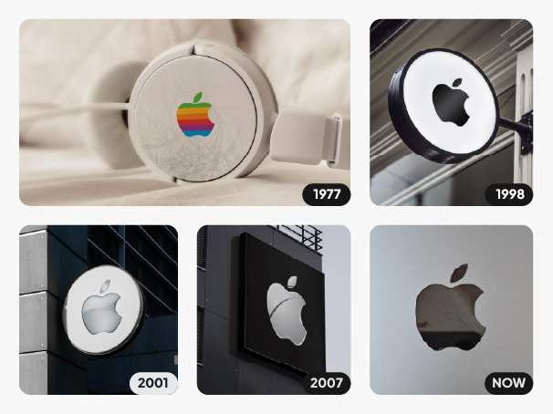
Apple shows a subtler version of the same principle: the surface treatment of the bitten-apple mark has shifted over the decades, from rainbow to glossy chrome, then flat, but the silhouette itself has stayed constant. The core shape never moved even as the finish did, which is why it still reads instantly on a chip, a billboard, or a phone screen without a structural redesign.
This isn’t luck. It’s what happens when a mark is built on clarity, simplicity, and genuine fit with what the brand stands for, rather than on whatever was fashionable the year it launched.
This is the kind of longevity I aim for when a brand’s goals call for it
What Happens When Trend Chasing Meets a Brand That Needed Stability
The clearest cautionary examples come from brands that had already built decades of recognition, then changed direction without weighing that cost.
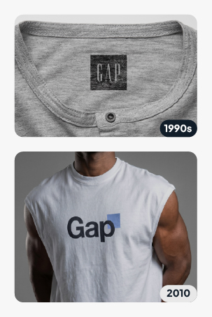
Gap, 2010. After twenty years with its iconic navy blue box logo, Gap swapped it for a generic modern wordmark with a small gradient square, reportedly costing around $100 million. There was no rollout plan and no warning to customers, just a new logo, dropped overnight. Within 24 hours: thousands of negative comments, a protest account with 5,000 followers, and nearly 14,000 parody redesigns circulating online. Gap reversed the decision in six days.
Cracker Barrel, 2025. As part of a roughly $700 million brand refresh, Cracker Barrel replaced its long-standing “old-timer” logo with a stripped-down, minimalist text mark. The backlash was severe enough that the company’s stock value dropped by close to $100 million within days, and customer traffic kept declining into the following quarter. Cracker Barrel scrapped the new logo and restored the original.
Tropicana, 2009. Tropicana redesigned its packaging and logo, removing the familiar straw-in-orange image customers used to spot the product on shelves at a glance. Sales dropped roughly 20%, an estimated $30 million loss, in just two months, largely because loyal customers couldn’t recognize the product anymore.
It’s worth being precise here: these were full brand overhauls, not logo tweaks in isolation, new packaging, store design, positioning. But in each case, the logo was the visible trigger, because it’s the one element customers use to instantly recognize a brand they already trust. The lesson isn’t “trend-based design is risky” — it’s that changing a recognition-critical asset without weighing what it costs a brand’s existing trust is risky, regardless of how the new design looks.
How to Choose the Right Approach for Your Brand
A: A seasonal pop-up or seed-stage startup testing an identity can afford to, or even benefit from, a trend-forward look. A brand planning to build recognition over 10+ years is better served by something built to age well.
A: Fashion, entertainment, and app-driven consumer products often benefit from the feeling of the moment. Professional services, healthcare, finance, and legacy brands tend to benefit more from signaling stability.
A: Gradient-heavy, effect-driven logos can struggle in single-color print, embroidery, engraving, or small favicon sizes. If your logo needs to work everywhere packaging, signage, apparel, app icons simpler tends to hold up better across all of them.
A: Trend-based logos generally need a refresh every 3–5 years as aesthetics shift. That’s a real cost: design fees, new signage, packaging, digital assets — worth planning for if you go that route, not a hidden surprise.
There’s no universally “right” answer — only the right answer for what a specific brand is trying to build. Here’s how that conversation works in an actual project, from brief to final files.