
Brand Identity
Where Ideas Become Brand Identity
This portfolio displays brand identity design work for clients. Each project encompasses custom logo design, visual identity systems, and brand storytelling designed to help businesses stand out. Below, you’ll see some real brand identity design examples in action.

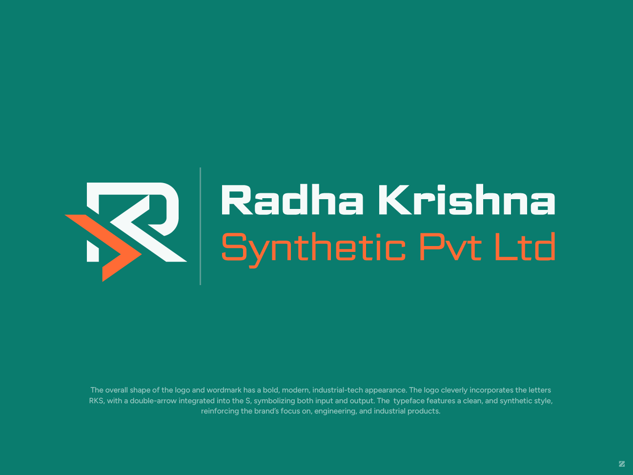
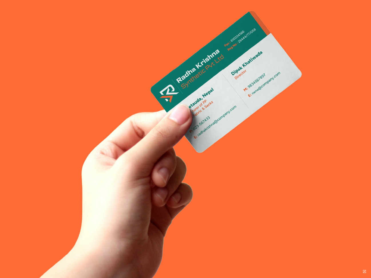
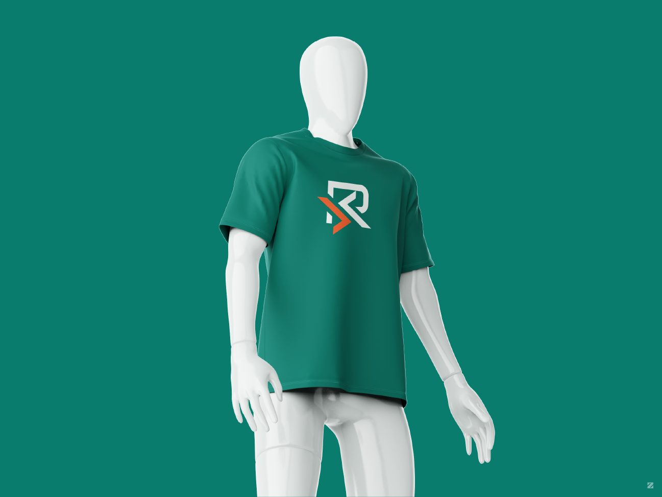
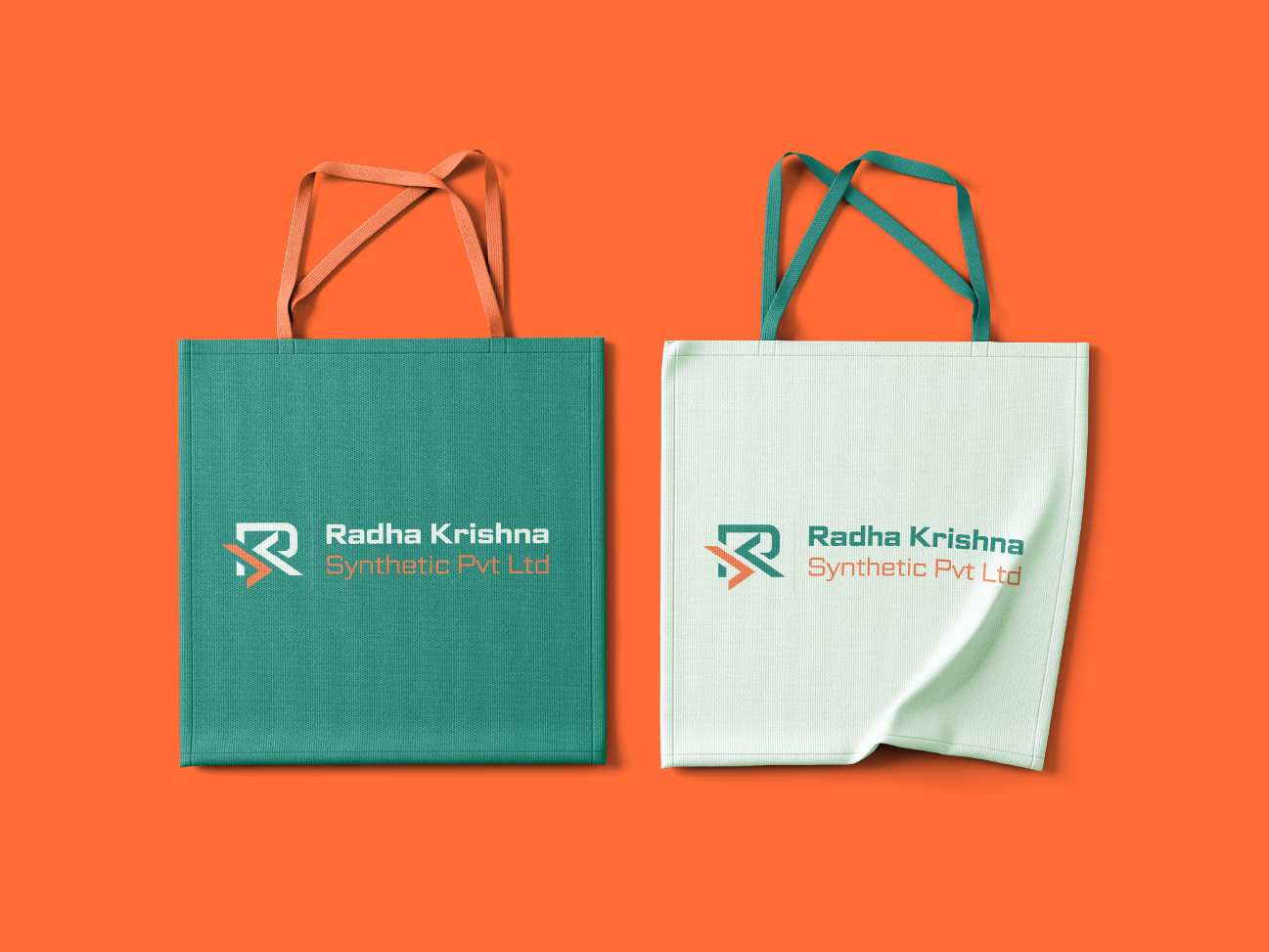
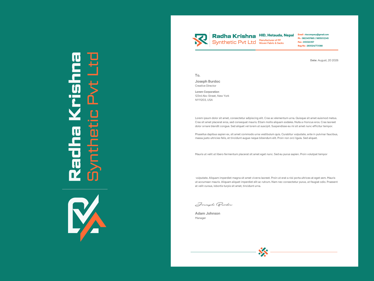
RKS: Brand Identity for a Synthetic Manufacturing Company
Radha Krishna Synthetic Pvt Ltd needed a bold, industrial identity that reflected their work in PP woven fabric and sack manufacturing. The logo merges the letters R, K, and S into a single mark, with a double-arrow built into the S to represent input and output — a nod to the production process itself.
Paired with a clean, technical typeface and a teal-orange palette, the identity carries the brand across business cards, apparel, tote bags, and stationery with a consistent, professional feel
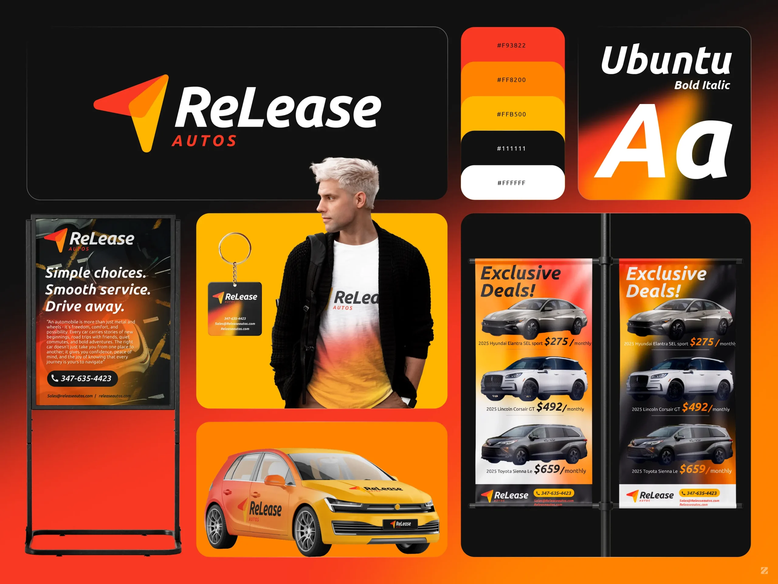

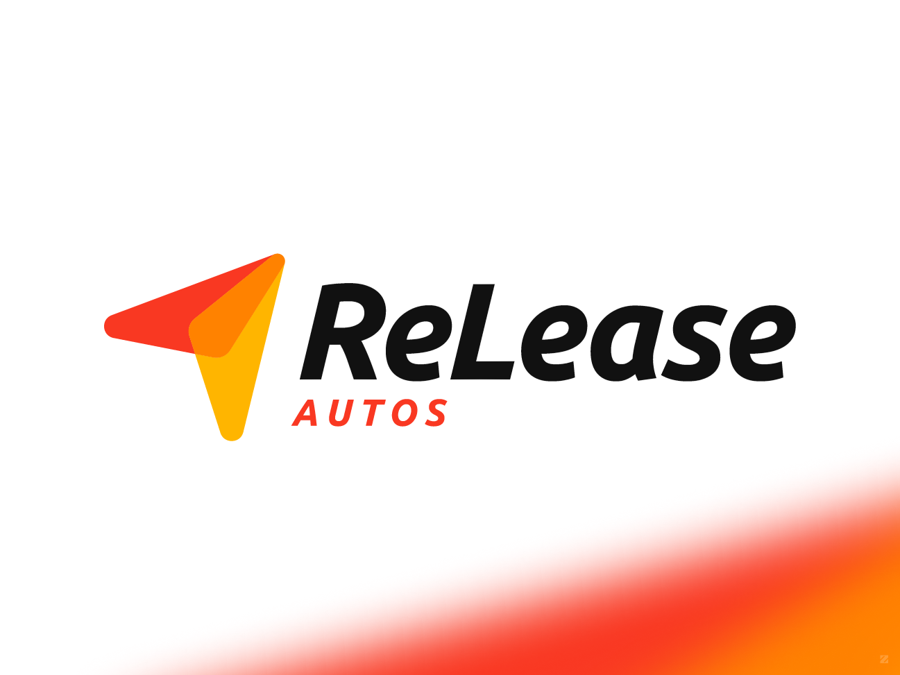
ReLease Autos – Complete Brand Identity Design
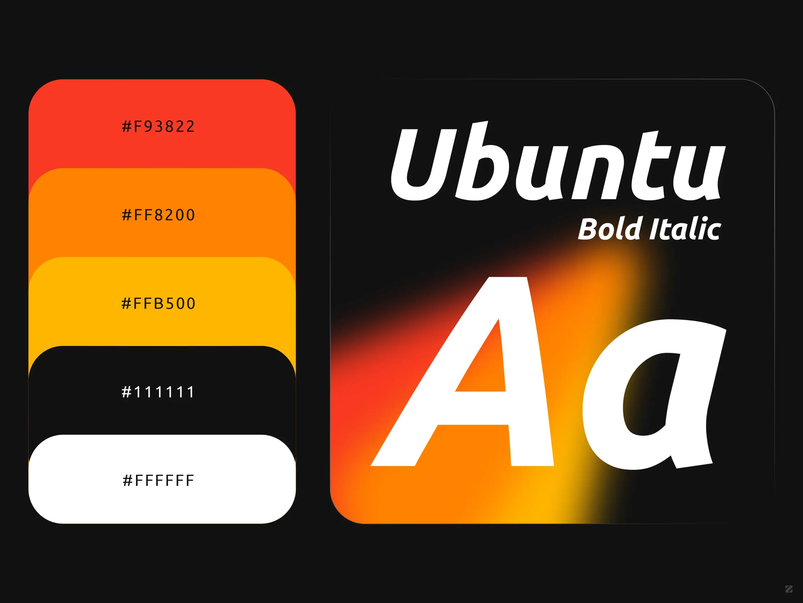
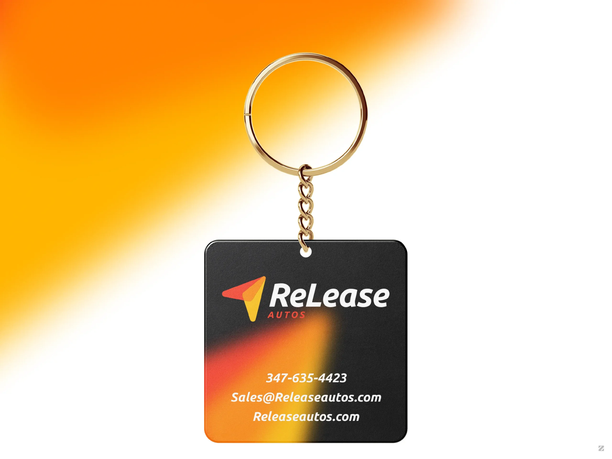
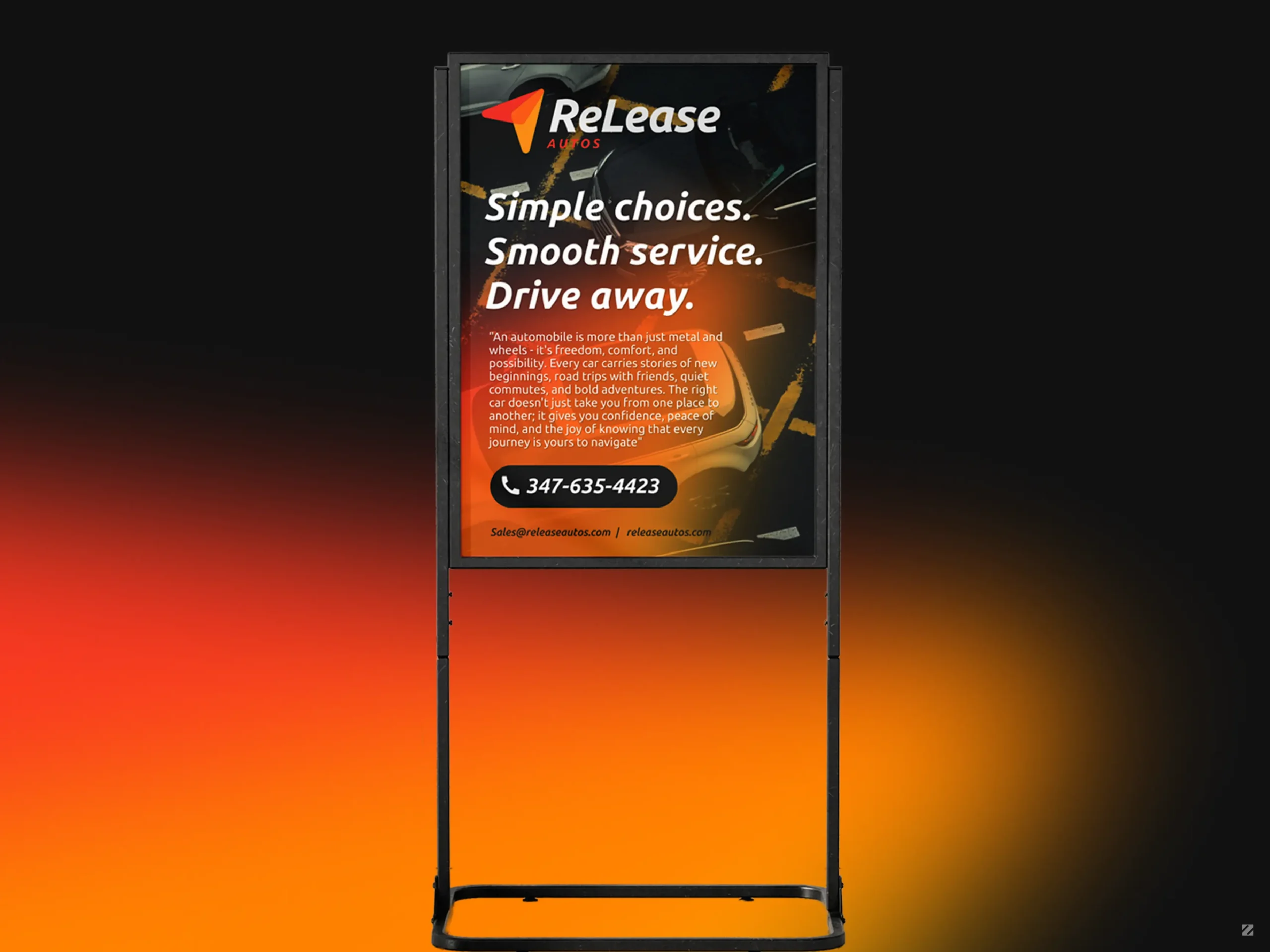
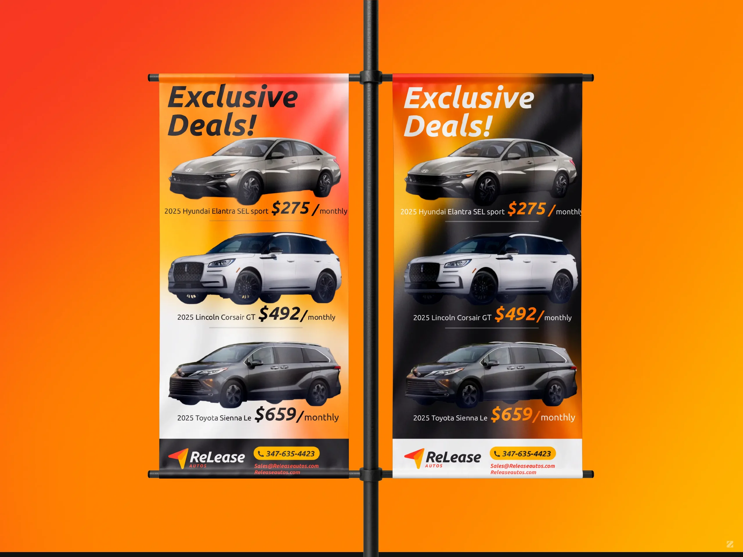
ReLease Autos approached ZakDesignz to build a complete brand identity from the ground up for their car leasing business, one that could feel bold and trustworthy from the very first impression. The foundation of the system is a dynamic flag/arrow logo mark paired with a custom Ubuntu Bold Italic wordmark, designed to feel energetic and forward-moving, much like the driving experience the brand promises.
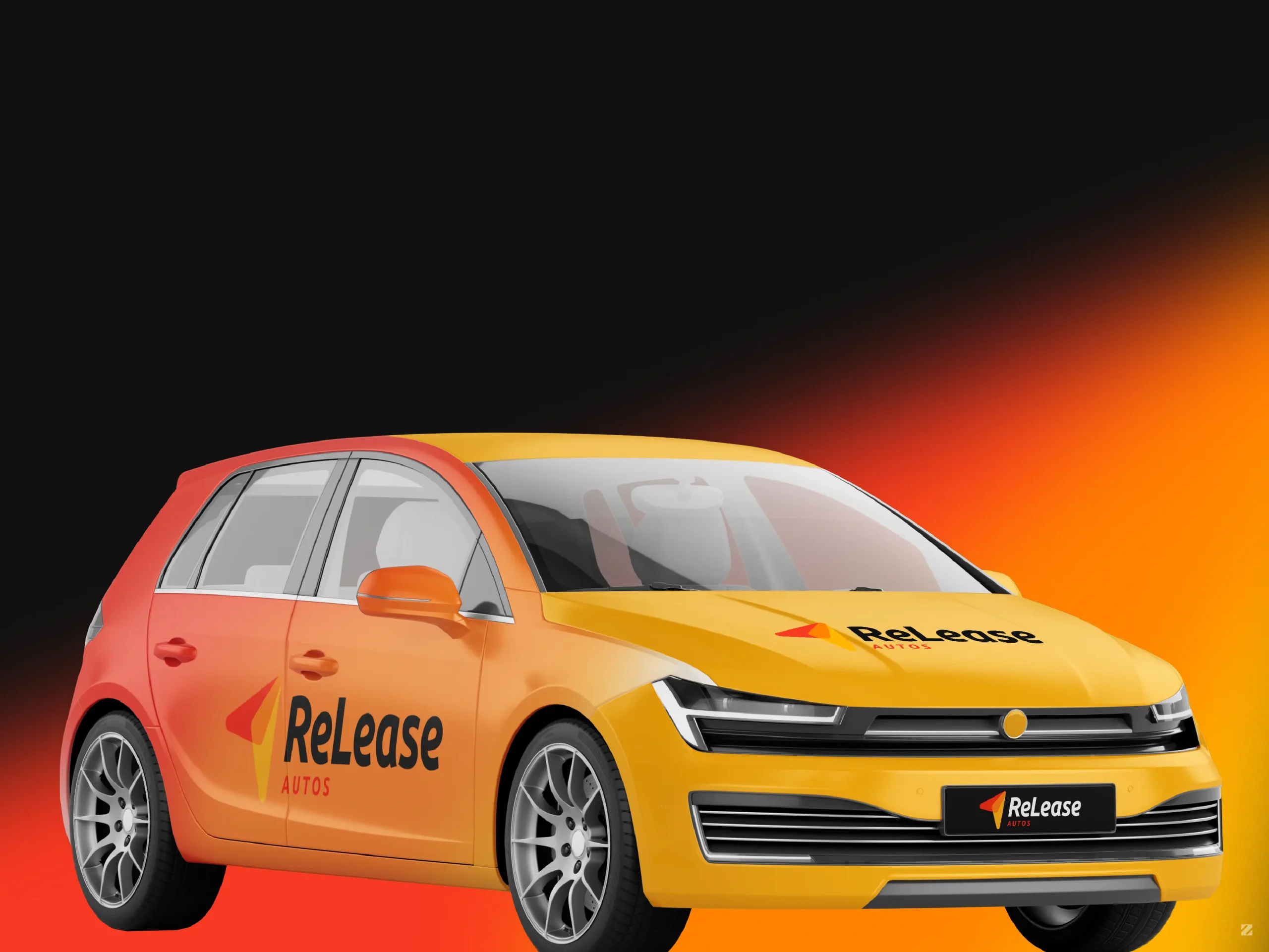
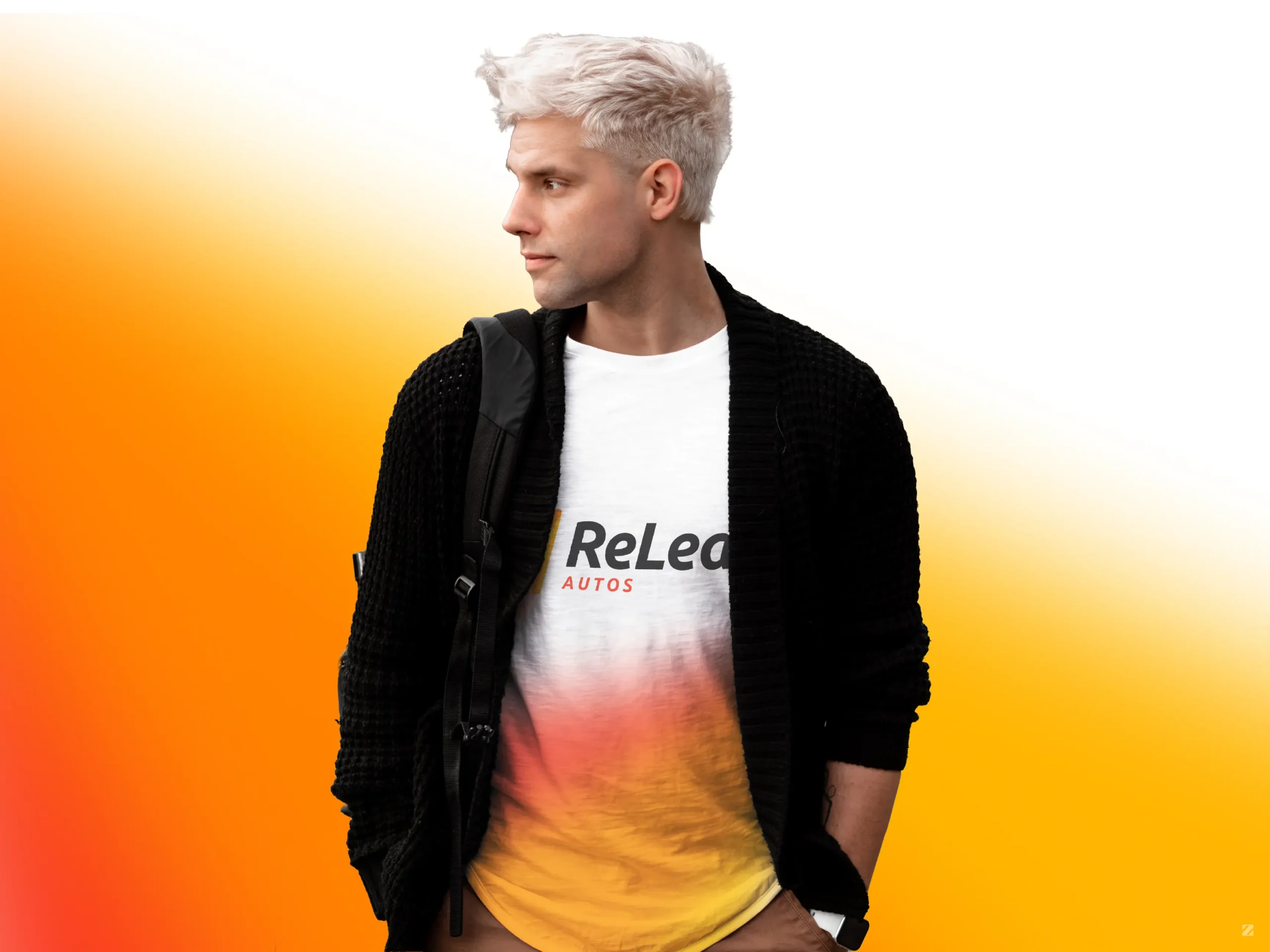
A warm gradient palette deep red fading into orange and gold became the signature visual thread running through every asset, reinforcing a sense of momentum, confidence, and approachability at every touchpoint. Rather than stopping at a logo and color palette, the identity was built out as a full, deployable system: vehicle wraps that turn the fleet into moving billboards, pull-up banners and digital signage for lot promotions and exclusive lease deals, branded apparel for staff and events, and keychains and print collateral that keep the brand present in customers’ hands long after they drive off the lot.
The end result is a brand that feels cohesive and premium across every format, from a car parked on the street to a banner at a pop-up event, giving ReLease Autos the kind of consistent, professional presence that builds trust with customers browsing lease options for the first time.
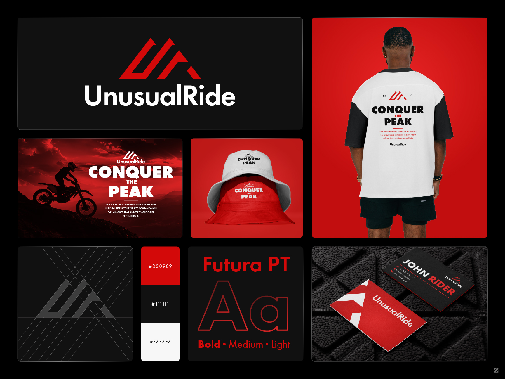



UnusualRide — Motocross & Adventure Apparel Brand Identity Design
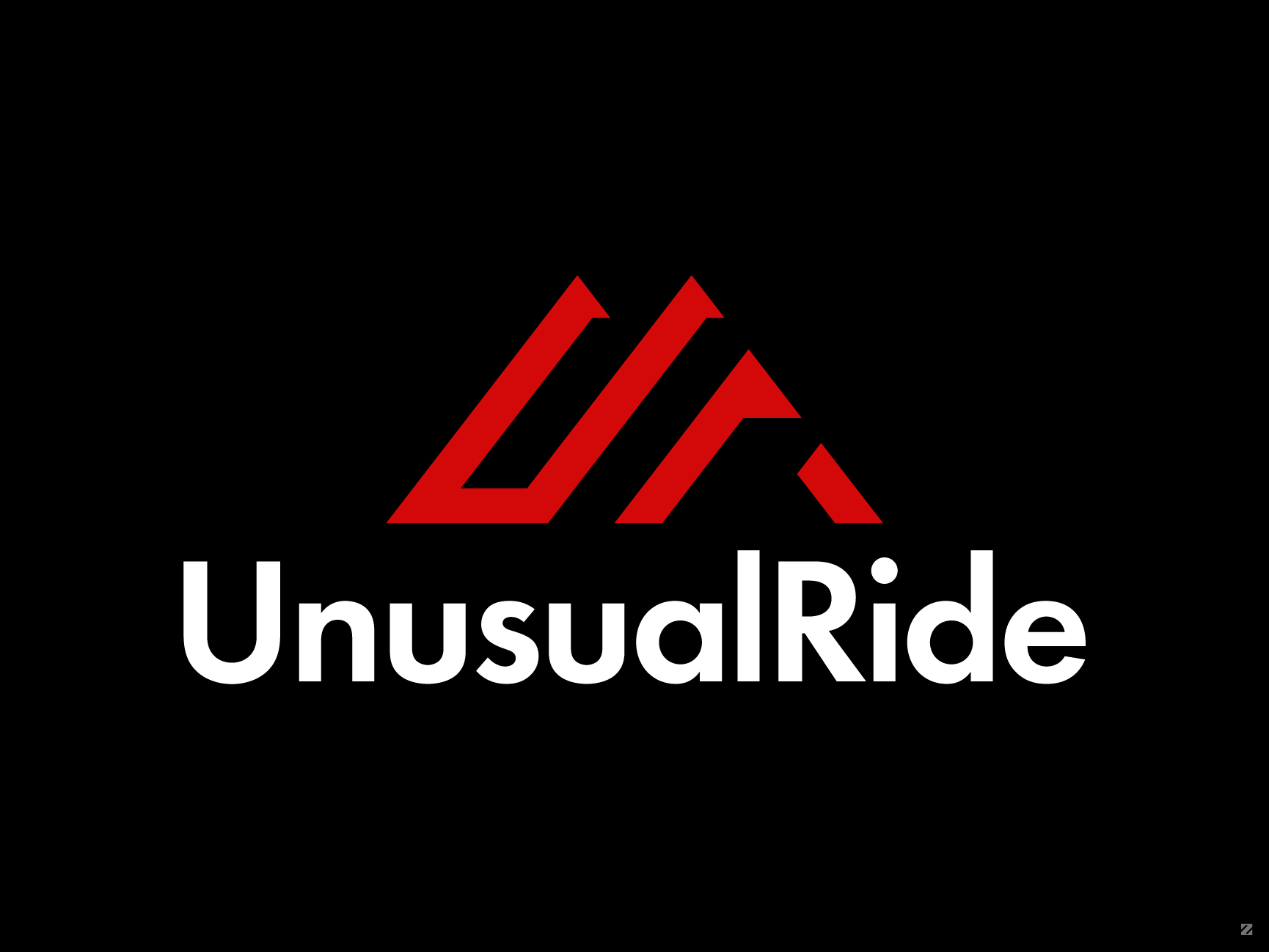
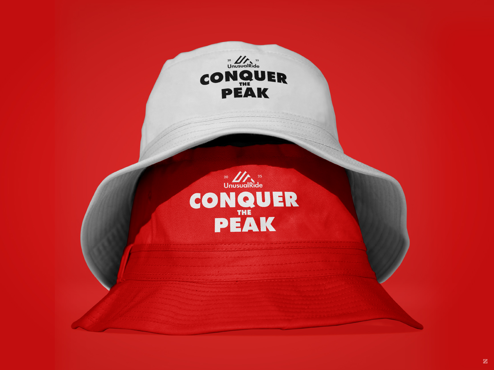
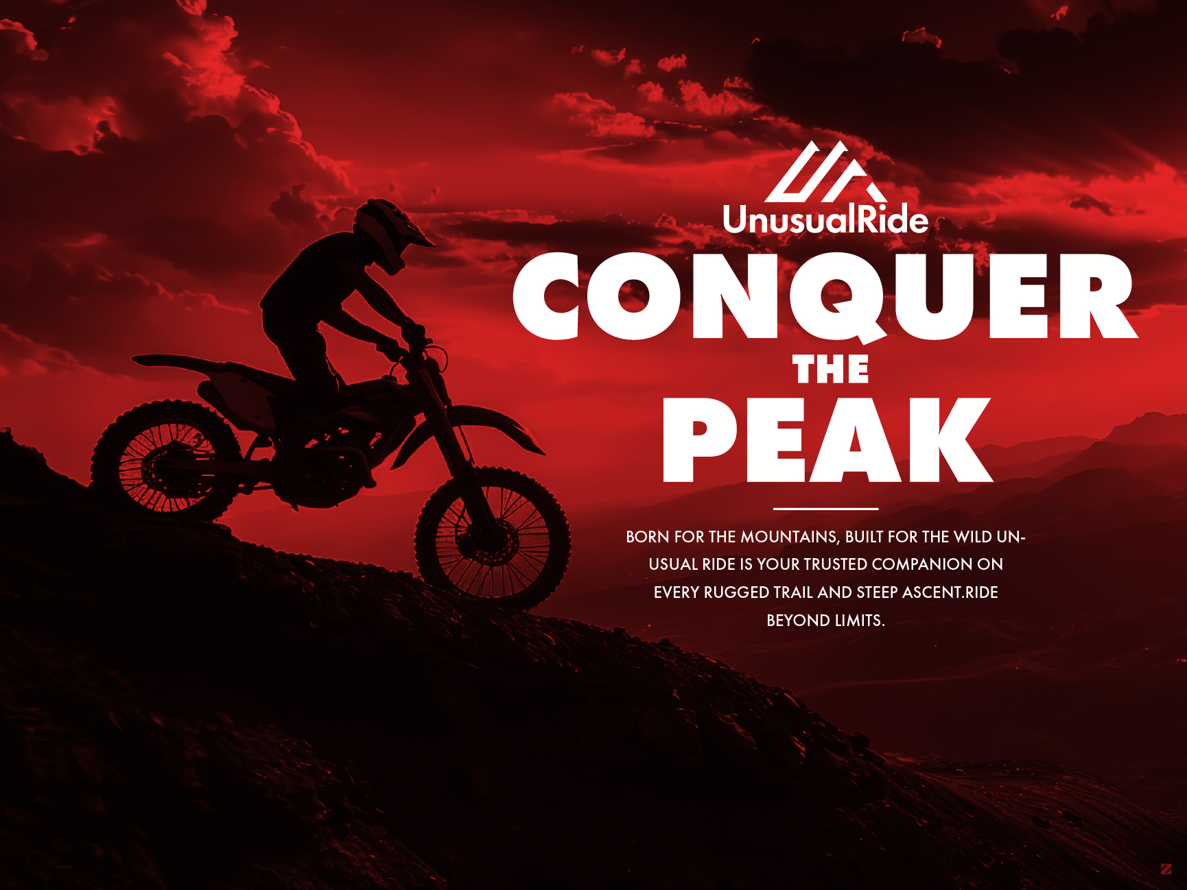
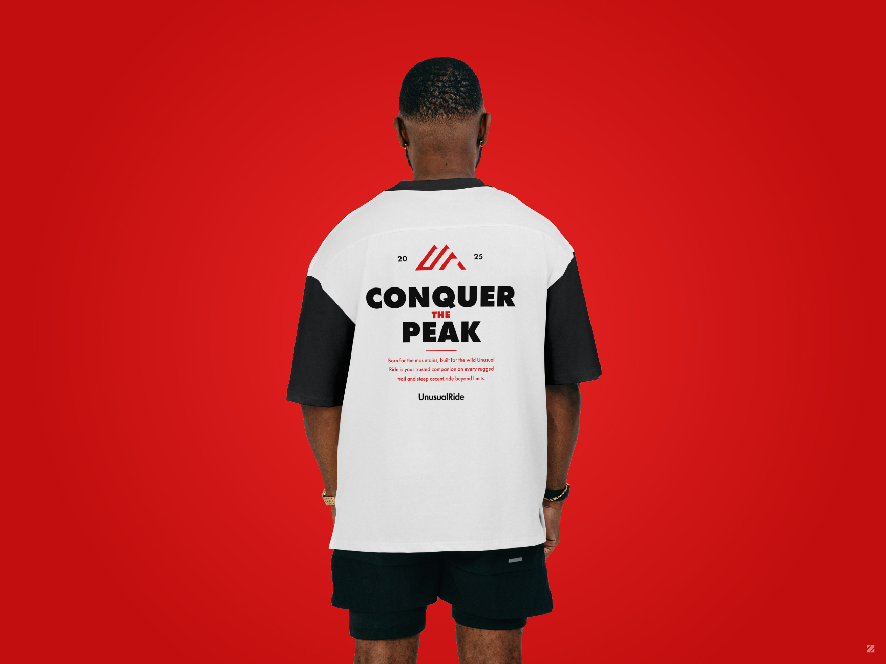
A bold sport logo design and premium branding project for UnusualRide, an off-road motocross apparel brand. This brand identity system features a mountain-peak monogram logo, a fearless “Conquer the Peak” tagline, and a striking red-and-black visual identity applied across streetwear, headwear, and stationery, a complete example of premium brand identity design for sports and apparel brands.
As part of this bold logo design and brand identity system, the mountain-peak monogram doubles as an abstract “UR” mark, staying sharp and recognizable at any scale from a small embroidered cap logo to a full-size banner ad. Combined with geometric Futura PT typography and a high-impact red-and-black palette, this premium branding project delivers a consistent, professional identity system across apparel, headwear, digital advertising, and business stationery.

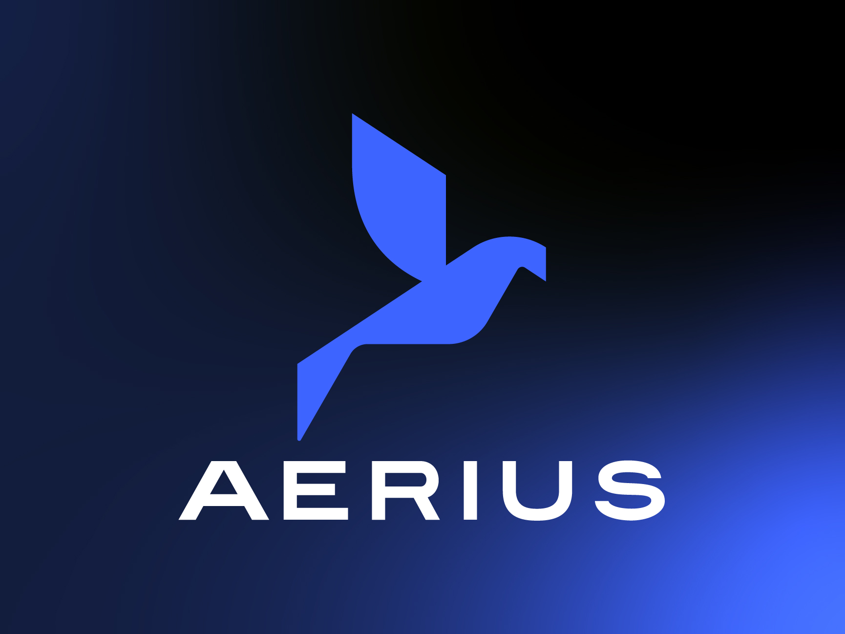
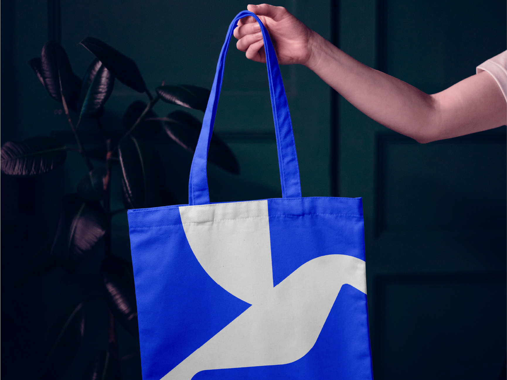
Aerius – Brand Identity for a Tech SaaS Company
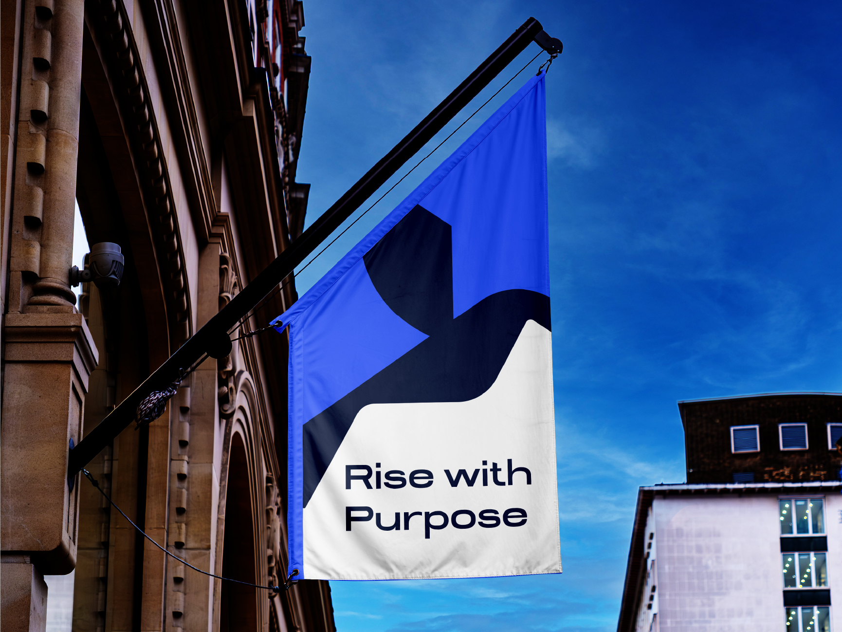
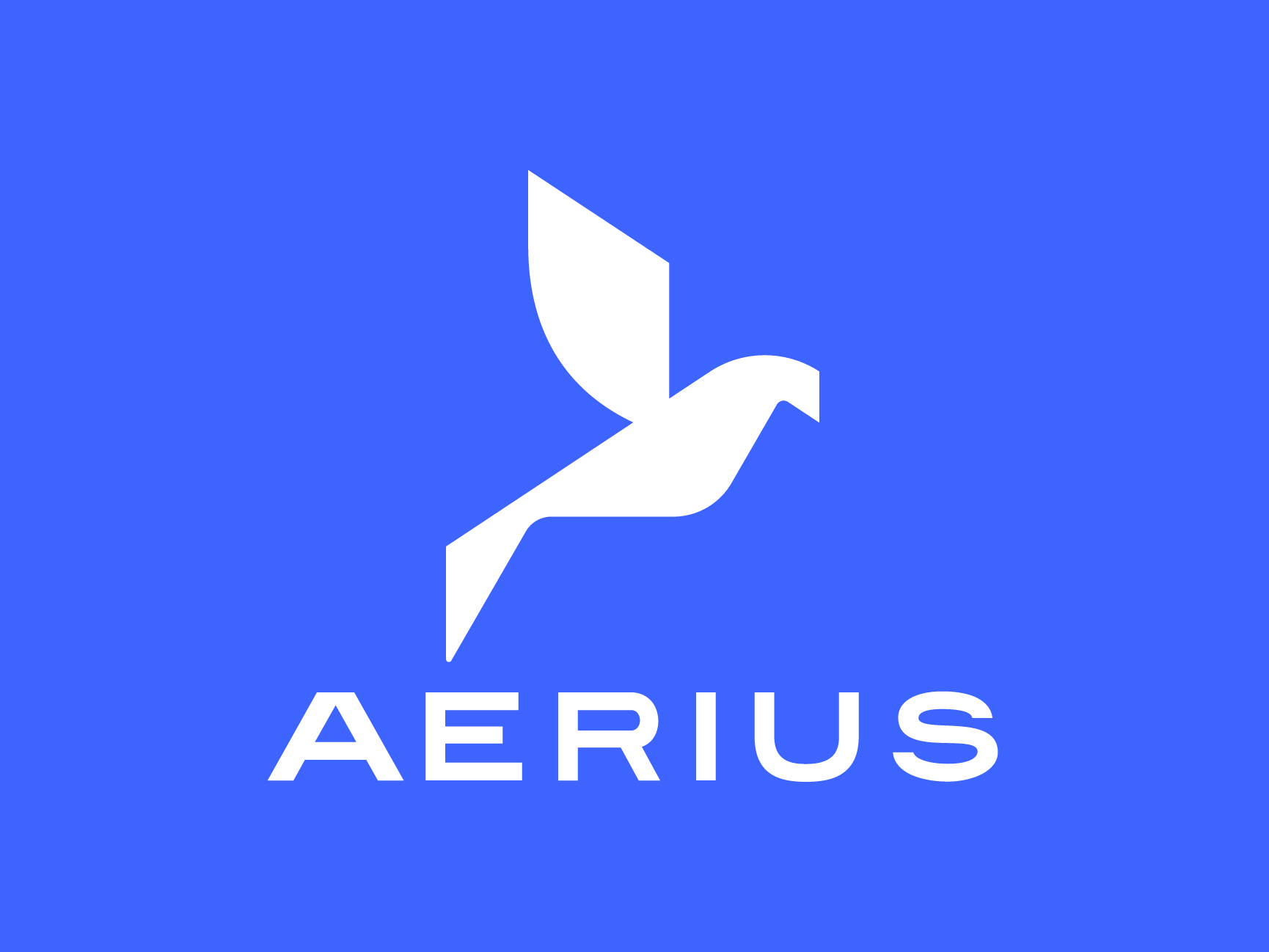
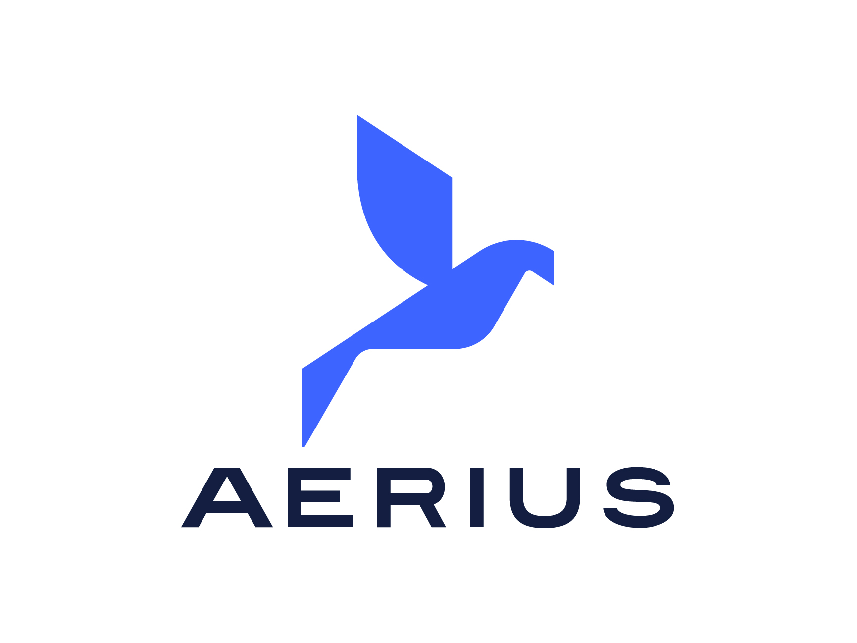
Aerius is a SaaS platform designed for speed, precision, and scale. The identity had to reflect that, so we designed a mark that moves.The bird-in-flight icon is made of geometric shapes, no curves, no softness. Hard angles, decisive cuts, the sort of clarity and efficiency that a modern tech product requires. The negative space does all the work, allowing the shape to breathe but remaining undeniably bold.
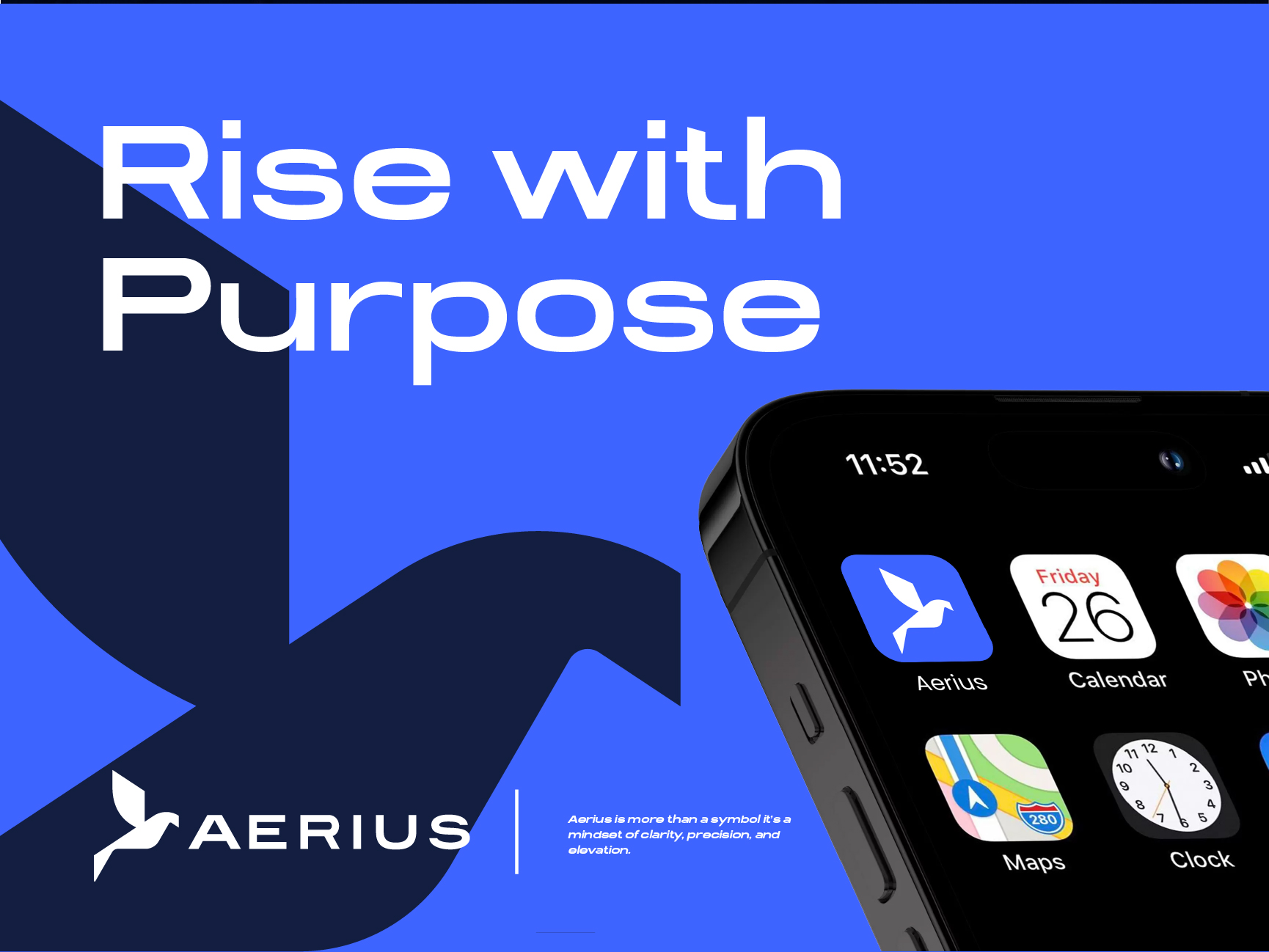
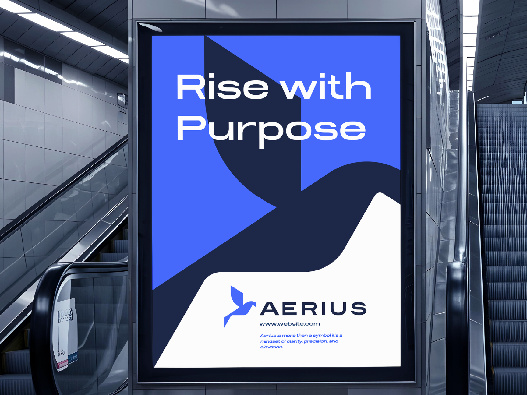
The palette is simple – electric blue for the key energy, deep navy for the base, white for breathing. It scales from app icon to outdoor billboard without losing any punch.
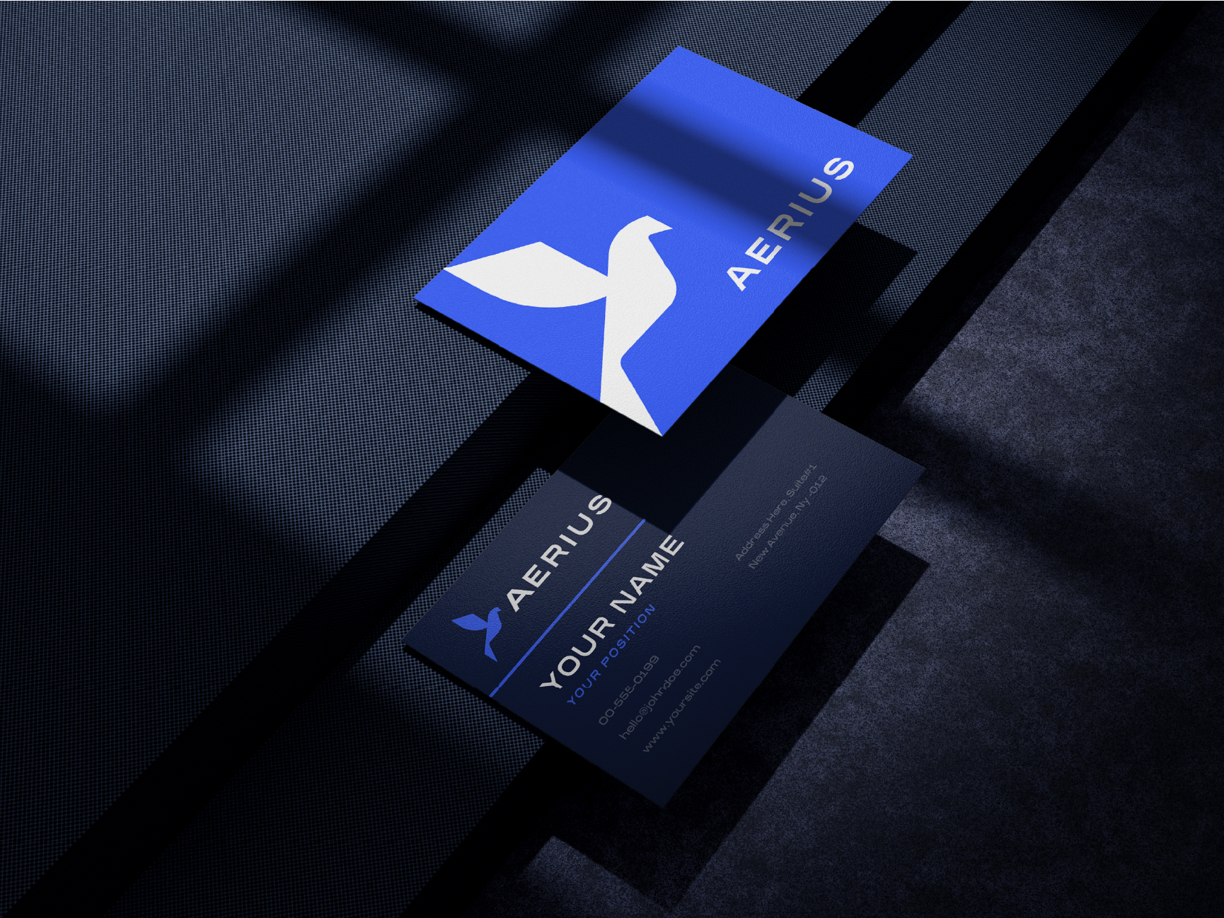
“Rise with Purpose” tagline speaks to what SaaS users really want, not just a tool, but forward movement. The system includes UI touchpoints, app icon, business cards, signage and branded merchandise, a complete identity ready for product launch, investor decks and everything in between.
RNN Sport Brand Identity
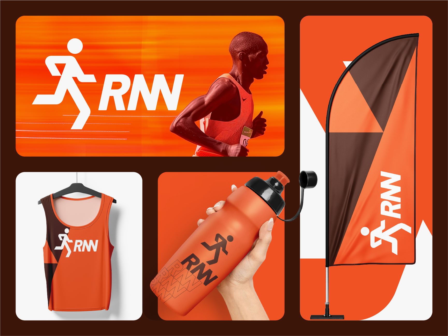
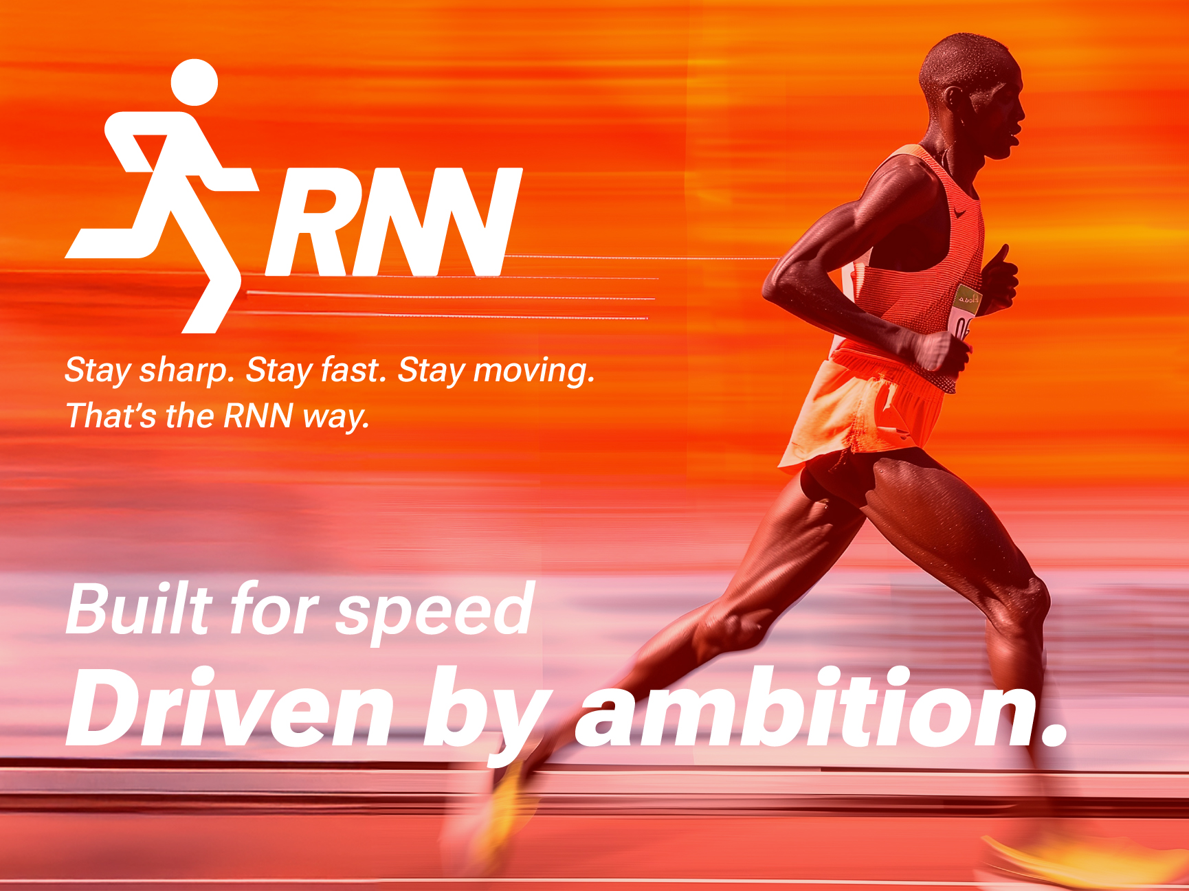
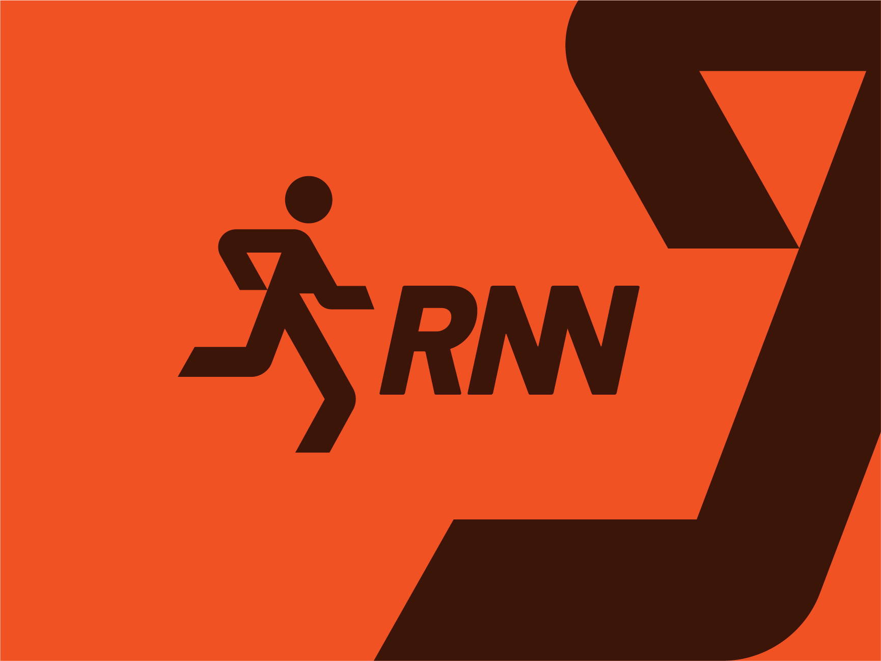
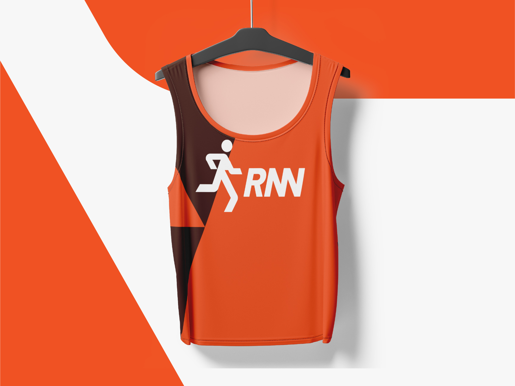
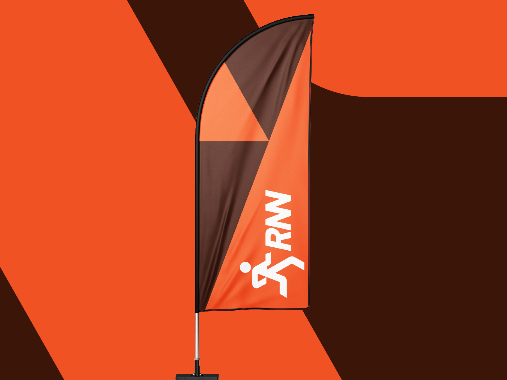
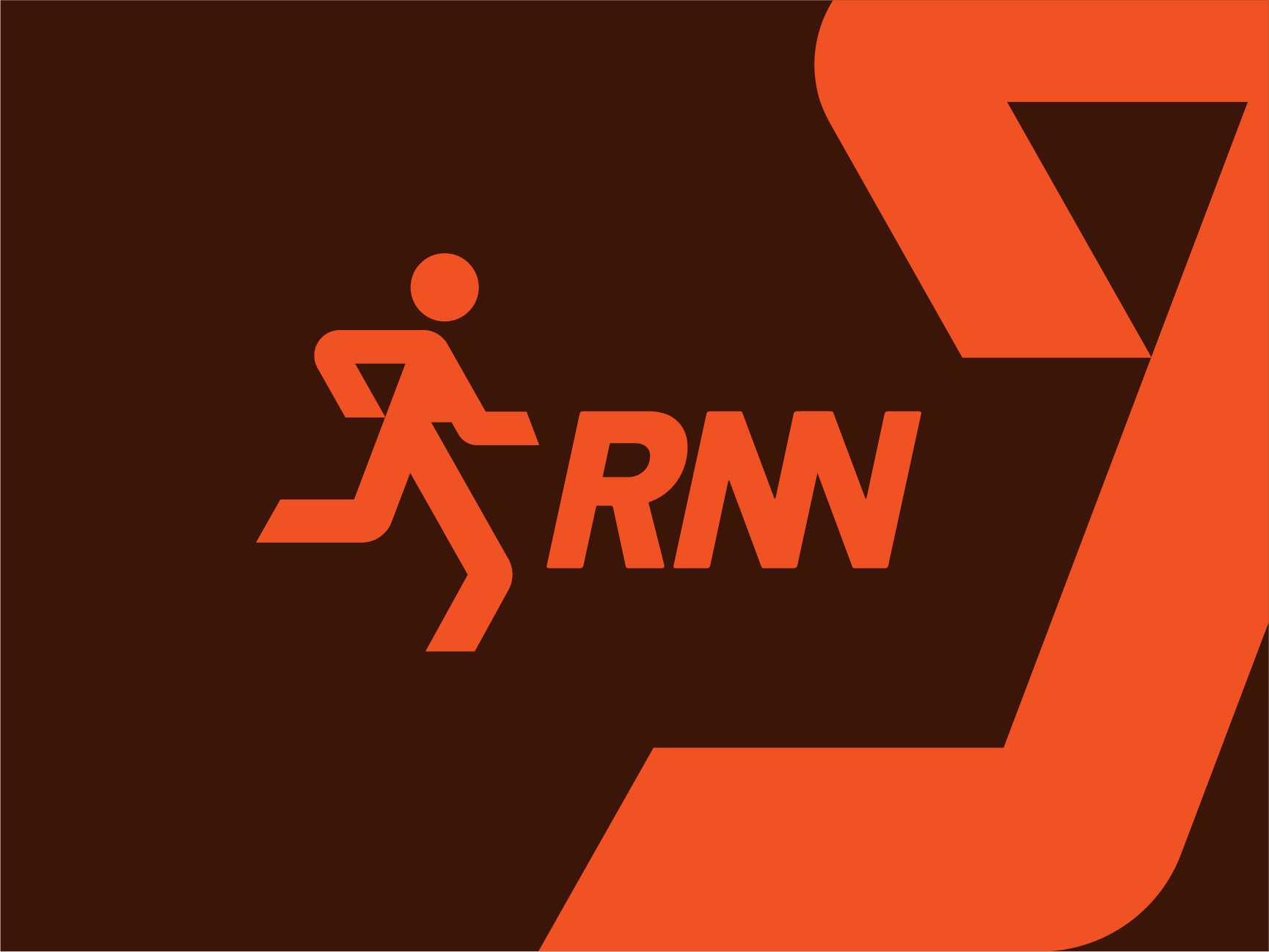
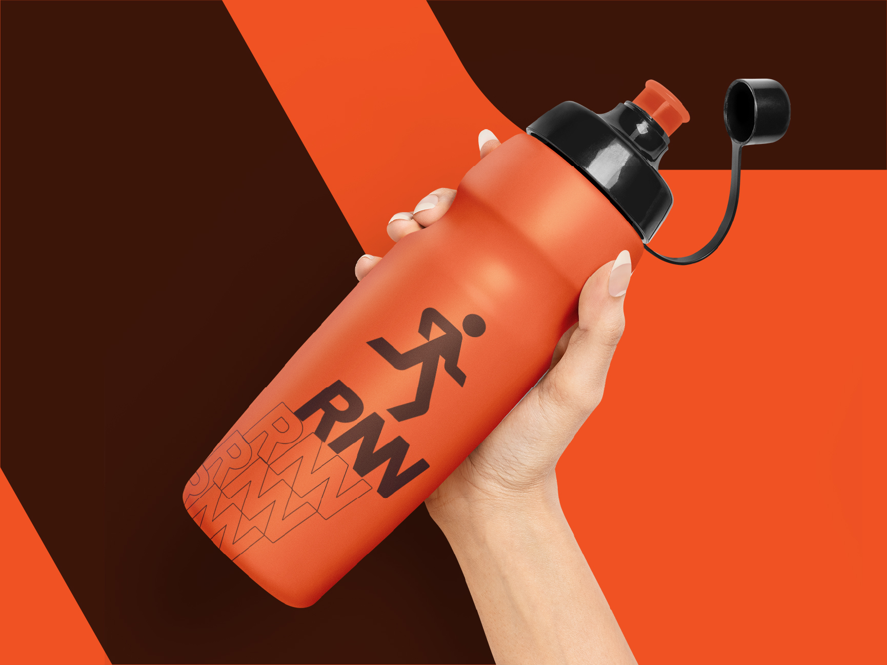
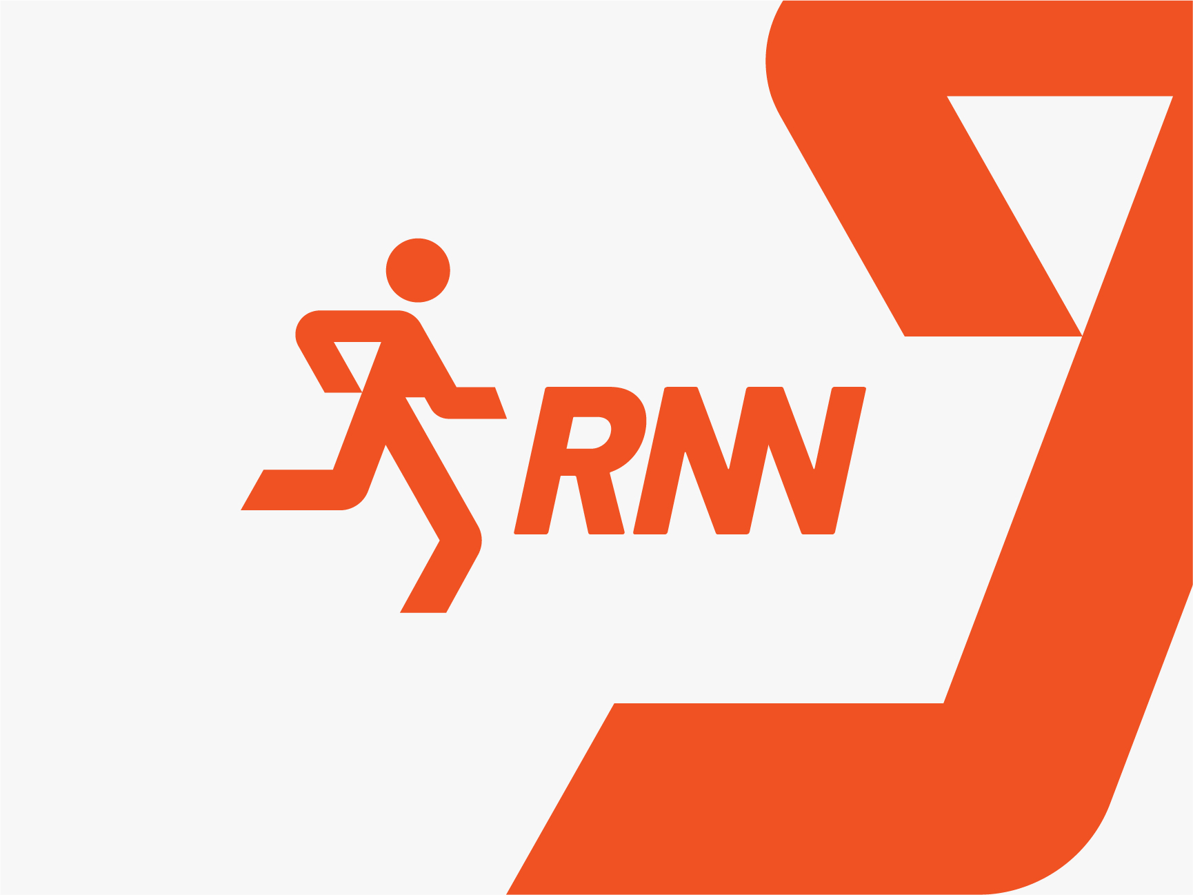
RNN Brand Identity – A sports brand built on speed, energy, & forward momentum. The logo features a dynamic runner icon and bold, italicized letterforms that give the feeling of motion in full stride. The orange and deep brown color scheme strikes a balance between raw energy and grounded confidence that pops in both digital and physical environments.
The identity translates seamlessly across touchpoints: a race vest that combines performance aesthetics with high brand recall, a water bottle that brings the mark boldly into everyday training and a feather flag that’s built for race-day visibility.

Kiban Dimension – Modern Tech Brand Identity Design
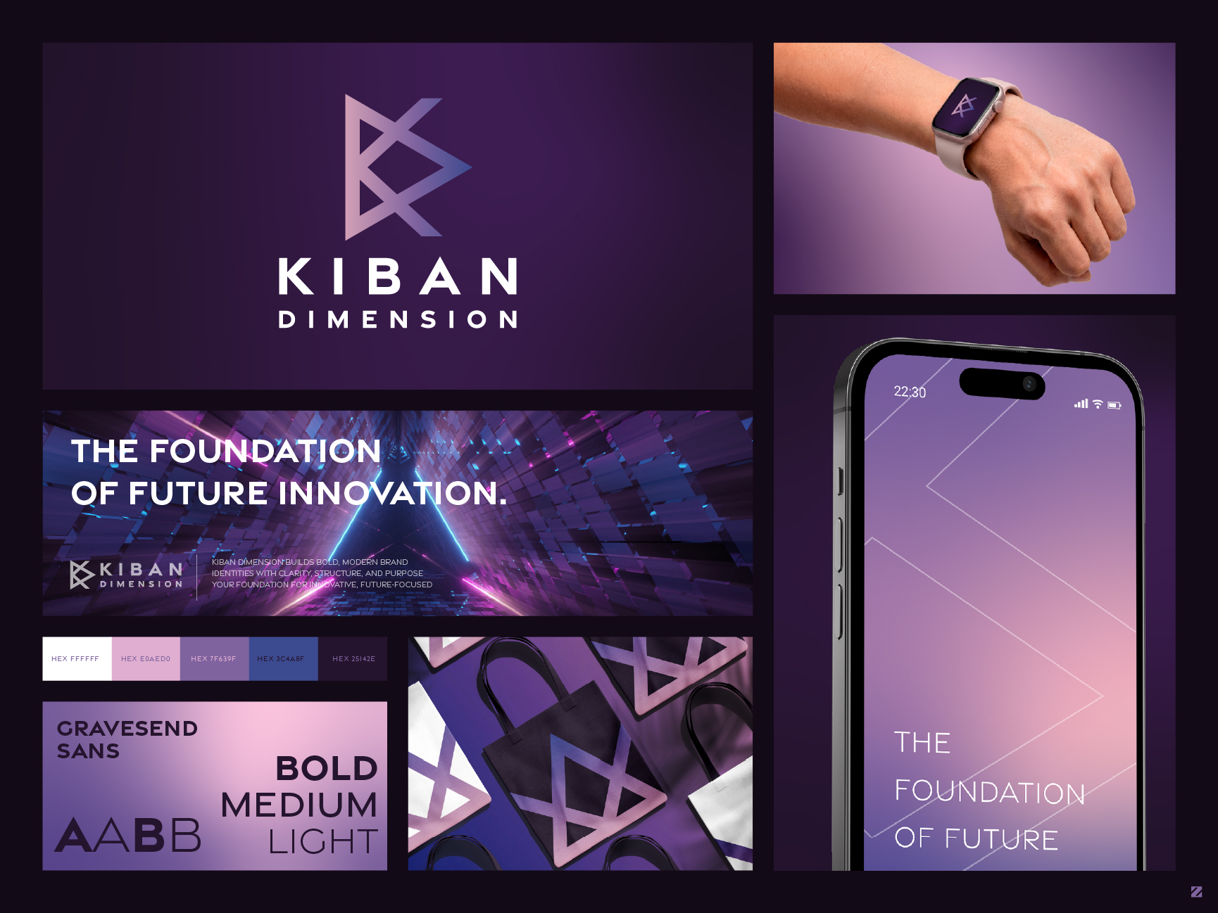
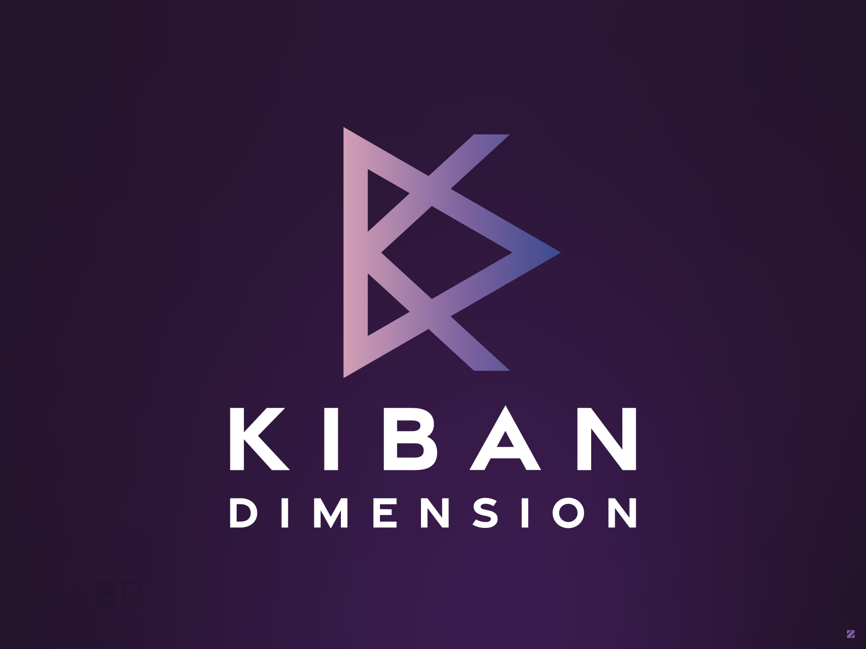
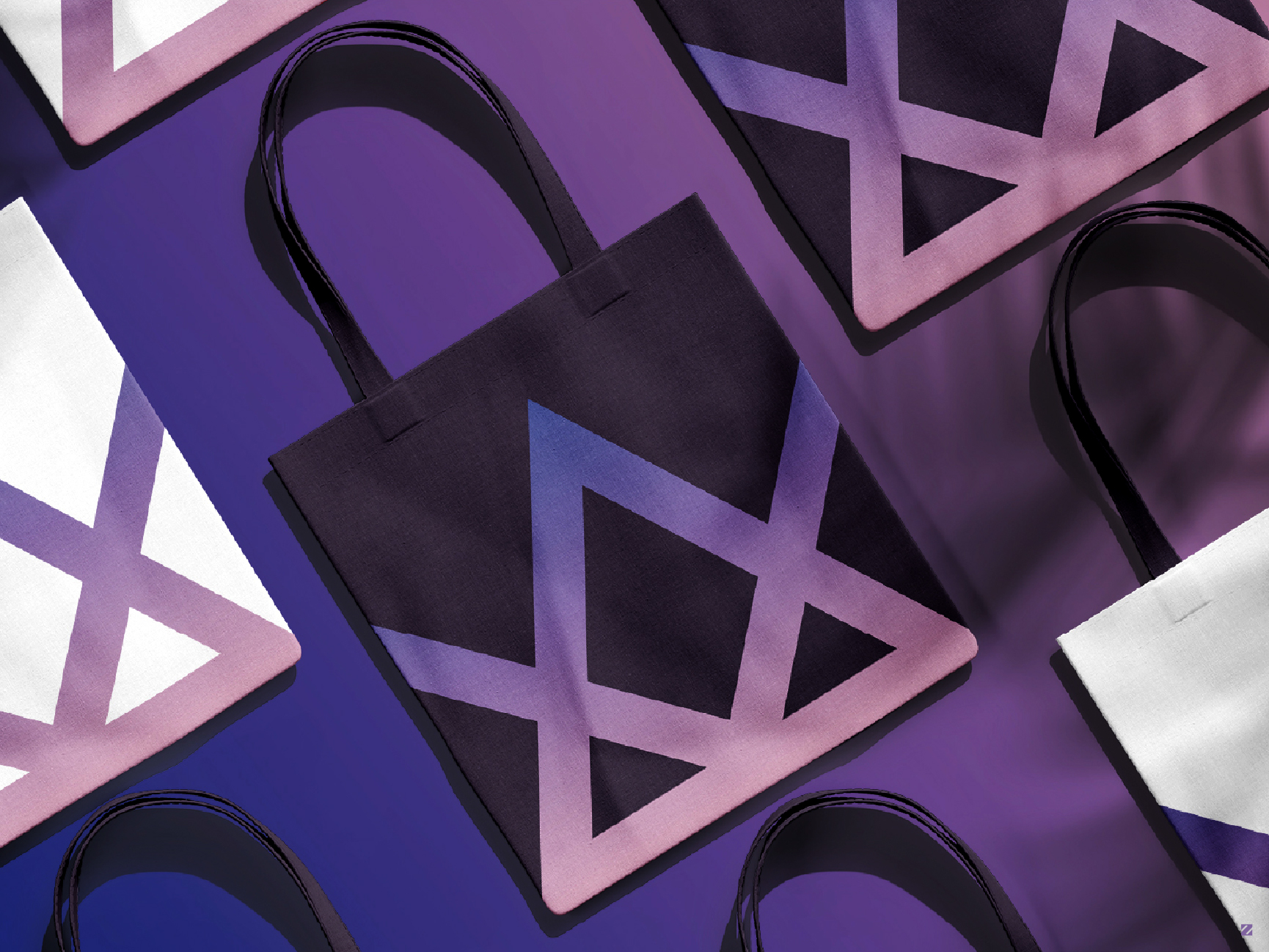
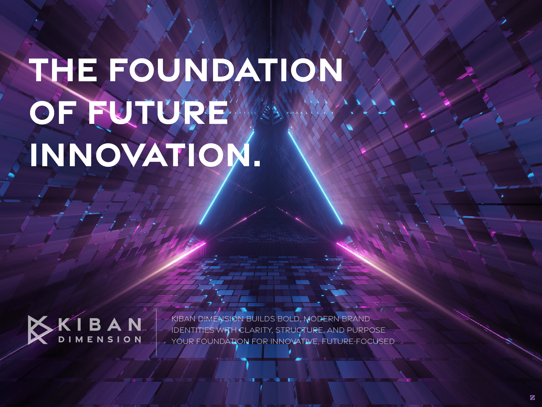
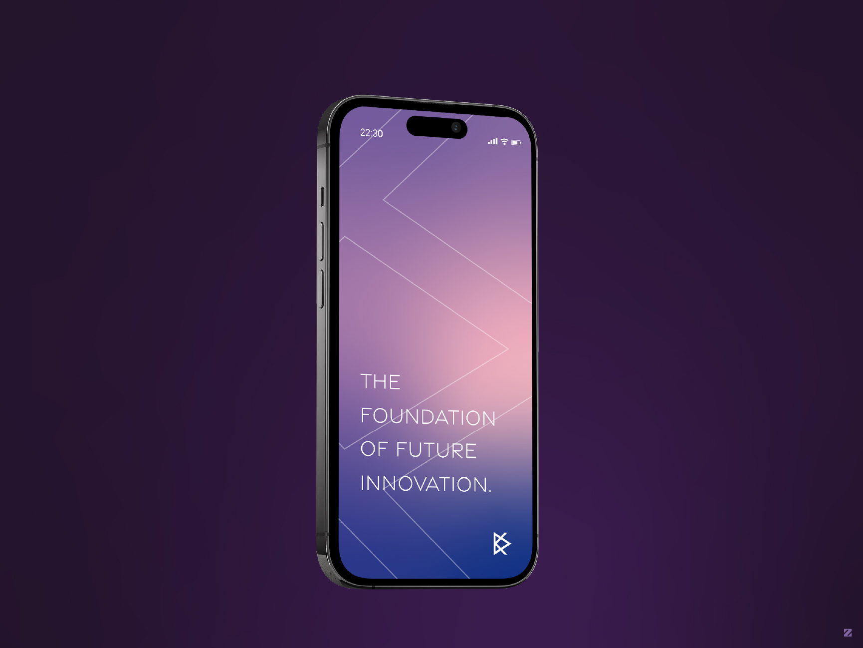
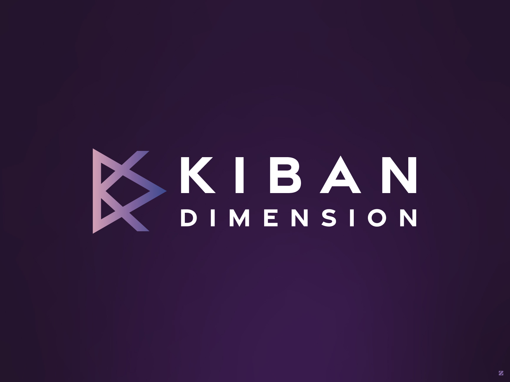
Kiban Dimension is a minimalist, modern brand identity built for a future-focused innovation company. The mark cleverly interlocks the letters “K” and “D” into a single dimensional symbol; the overlapping triangular forms create a sense of depth and perspective, visually representing “dimension” itself. Finished in a clean gradient of soft lavender to deep indigo, the logo carries a sleek, tech-forward feel across every touchpoint.
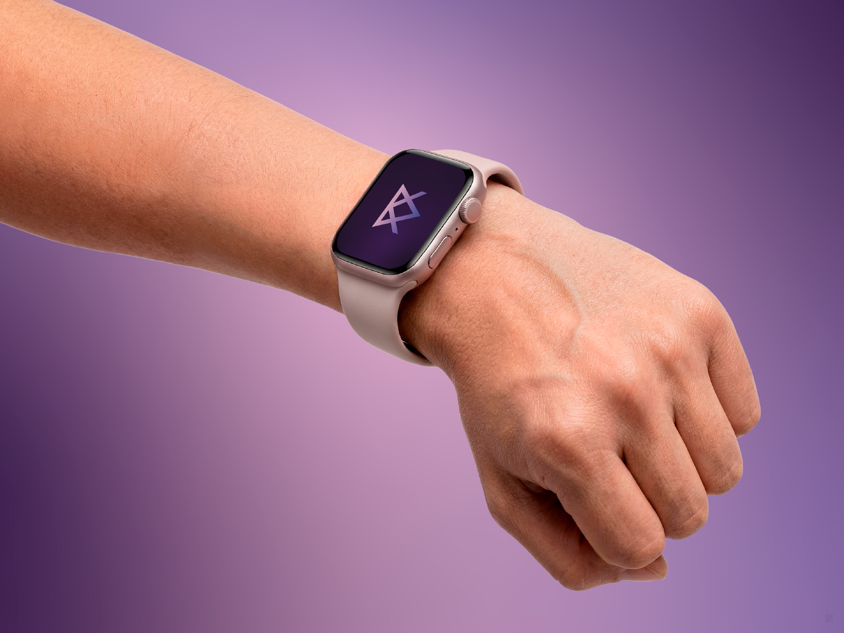
The identity system includes a full color palette, Gravesend Sans typography across Bold, Medium, and Light weights, and real-world applications spanning app UI, smartwatch interface, and tote bags – all tied together under the tagline “The Foundation of Future Innovation.”
Designed to feel structured, layered, and scalable across digital and physical brand touchpoints.


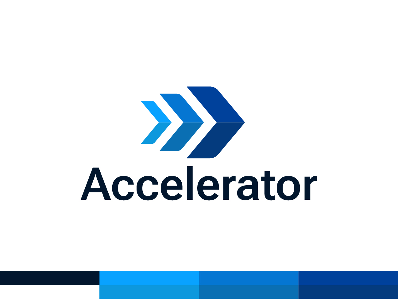




Accelerator – Brand Identity Design
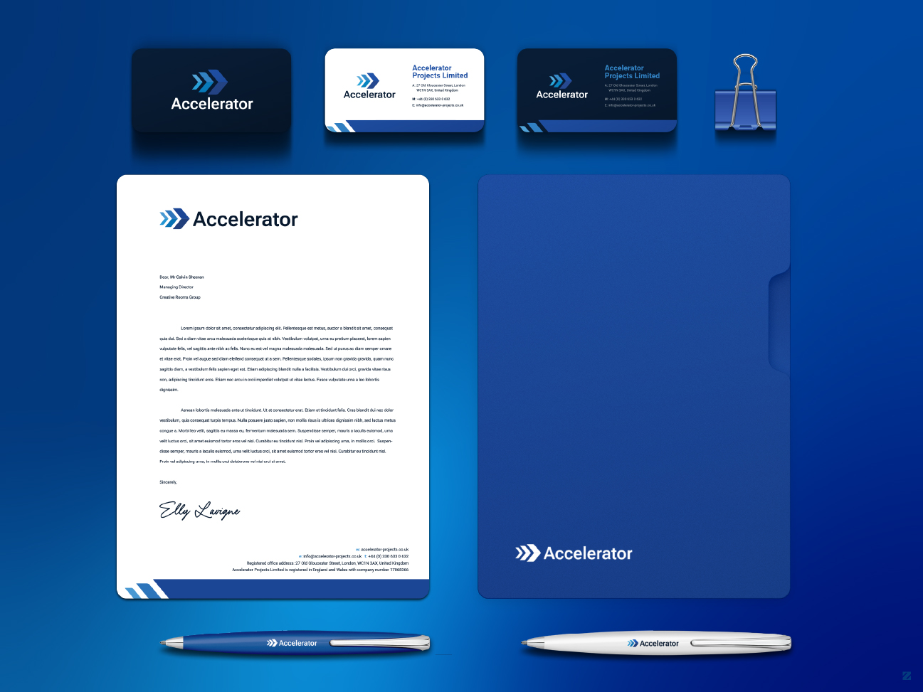
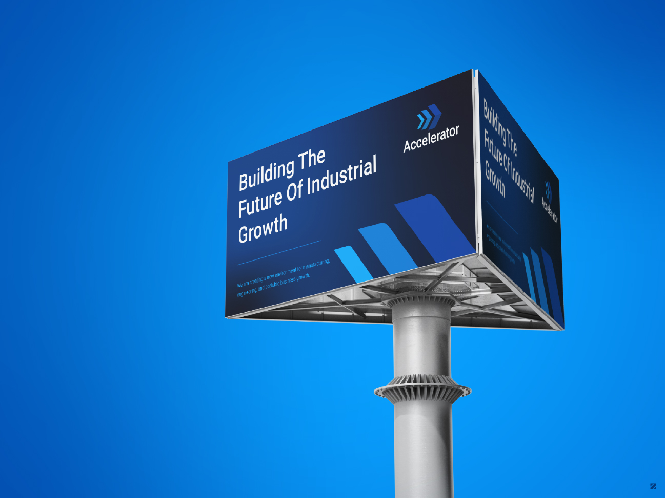
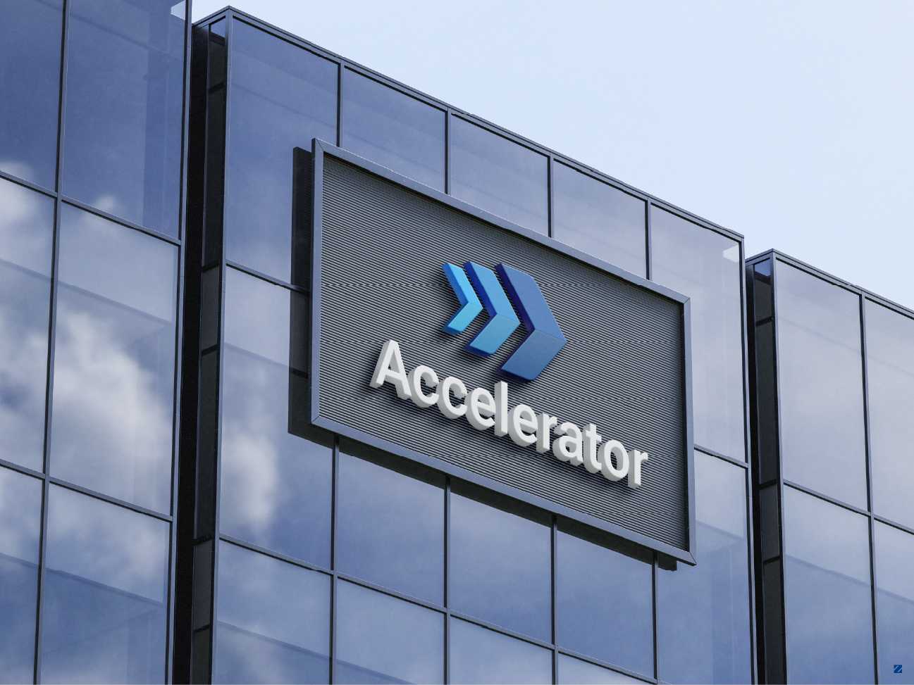
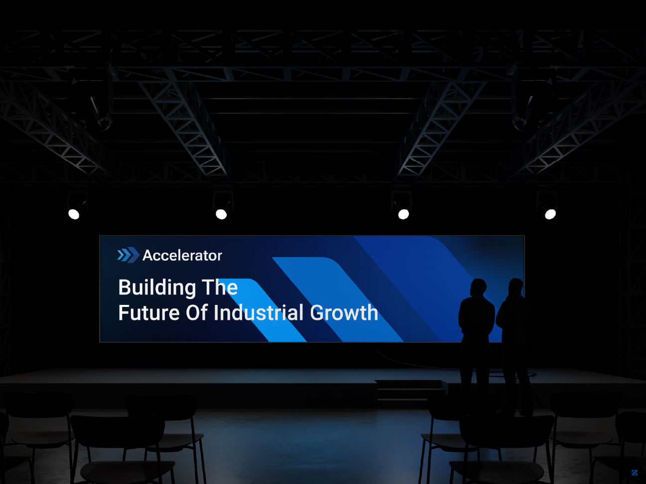
Accelerator needed more than a logo; they needed a modern, timeless logo design that would still hold up years from now, not just at launch. The identity centers on a layered arrow mark that steps from light to deep blue, signaling forward momentum, paired with a bold geometric wordmark that leans gradually into motion. It’s a design built to work well across every scale and surface, from a business card to a building façade, without ever feeling dated.
Every element was tested against real-world applications before final delivery: stage screens, outdoor billboards, exterior signage, and a full stationery suite. The result is a brand identity Accelerator Projects can grow into for years, not one they’ll need to redesign in two.