

Clients see the final logo in 5 minutes, but they never see the 3 days spent refining a single piece of negative space.
What a Logo Designer Actually Does Before You See the Final File
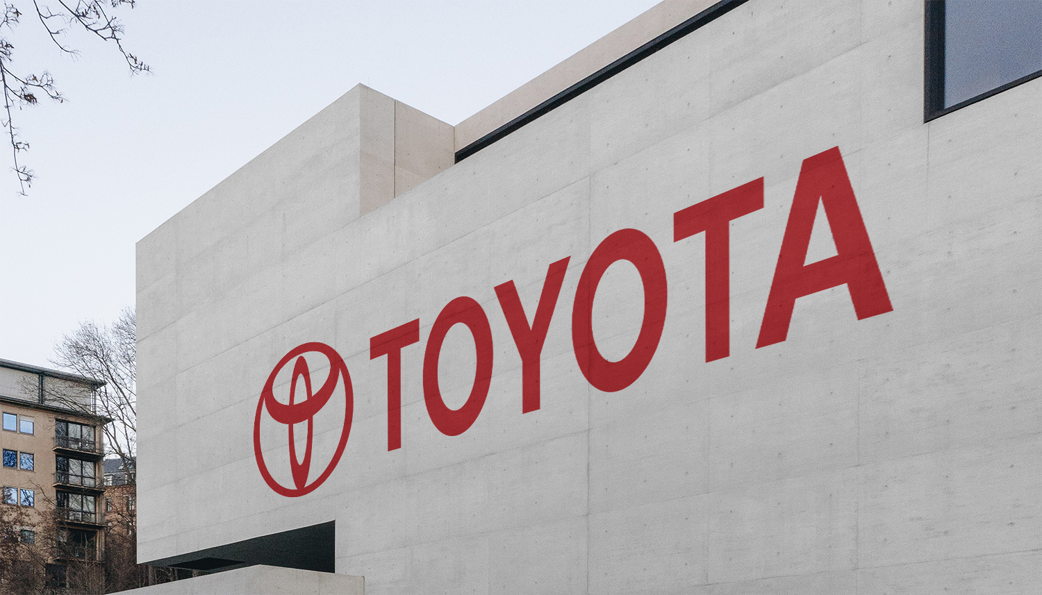
Toyota
Those three overlapping ovals contain every letter of the word TOYOTA hidden inside them. That’s not a coincidence. That’s a designer obsessing over geometry until the mark earns its own existence.
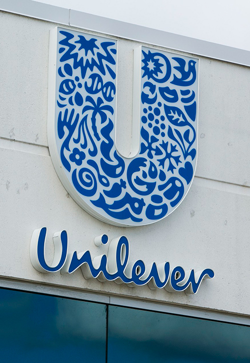
Unilever Logo
Take a good look at the “U”. It’s made up of 25 hidden Icons Inside one Letter – a bee, a flower, a strand of DNA, a hand and more – each symbol representing a different product line and part of the brand’s ecosystem. They are assembled into a single shape, mirroring how all these disparate elements are contained under one identity. Most people have seen this logo thousands of times, but most people never notice the depth hidden within it.
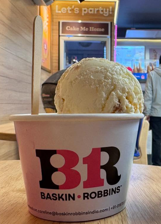
Baskin-Robbins
The pink shape within the “B” and “R” cleverly creates the number 31 – which represents their original promise of 31 flavours, one for each day of the month. It’s a simple, but powerful detail that turns the logo into a storytelling piece. A design choice you only notice once, but never forget afterwards, having been hidden in plain sight for decades.

FedEx
The arrow concealed between the “E” and “x” is arguably the most famous use of negative space in design history. It speaks, silently, of velocity, accuracy, progress of the forward kind—values embedded in the brand’s DNA without being spelled out. But most people don’t know designer Lindon Leader went through more than 200 variations to get to that perfect arrow. It’s a reminder that great design often seems effortless, but is built through relentless refinement and attention to detail.
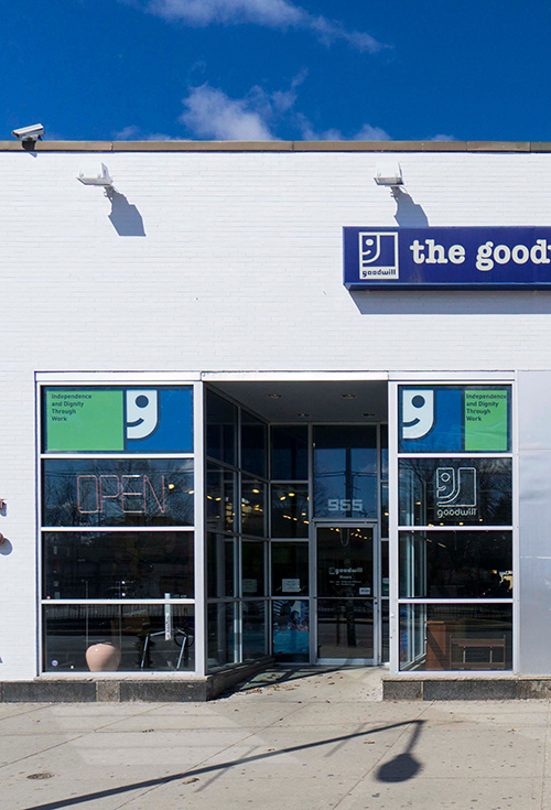
Goodwill
The logo is a smiling face, but paired with the wordmark the “g” also functions as a subtle emotional cue—reinforcing warmth and friendliness without explicitly stating it. This is an intelligent use of type and balance of shapes, where the meaning is not only seen, it’s felt.
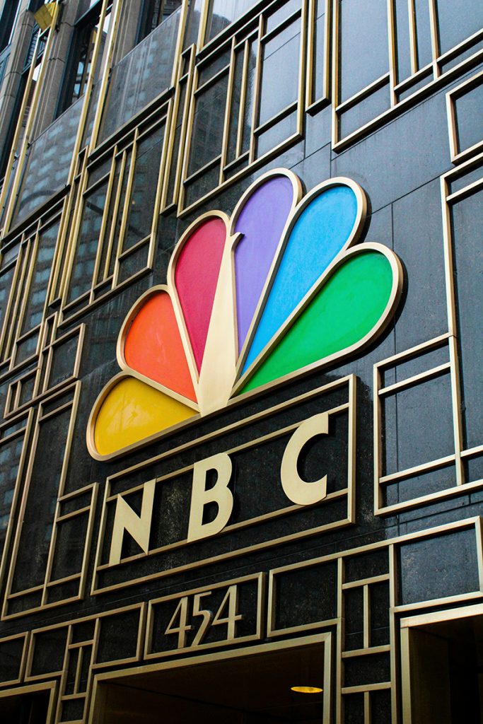
The NBC peacock
Six coloured feathers, each representing one of the network’s original divisions, with the peacock facing right to symbolise looking forward. But the real design achievement is that those six colours had to remain distinct from one another on early colour television sets.
This is what the sketch phase is actually for. Not to “rough out ideas” — but to find the moment where the logo starts doing more than one job at the same time. A mark that works on a storefront, an app icon, an embroidered hat, a black-and-white fax, and a billboard in the rain — that kind of durability doesn’t come from trends.
It comes from a designer who refused to stop asking
“can this do more?”
That’s the work clients don’t see.
But they feel it every single time someone recognises their brand without thinking.
Get a Custom Logo →
Custom Logo Design by ZakDesignz