
Kiban Dimension – Brand Identity Design
Overview
Kiban Dimension is a bold, future-facing tech brand built on structure, clarity, and forward motion. The client needed an identity that felt technical and premium without tipping into cold or generic “tech-blue” territory, something with real depth, dimension, and a distinct visual signature.
We led the project end-to-end: brand strategy, logomark design, color and typography system, and a full mockup suite showing the identity across digital products and physical touchpoints.
- Scope: Brand Strategy · Logo Design · Visual Identity System · Brand Guidelines · Mockup Presentation
- Timeframe: 3 weeks
- Client: Kiban Dimension
- Industry: Technology / Innovation
Kiban Dimension Brand Identity Design: The Brief
The client wanted a mark that felt structural and multidimensional, a nod to “Dimension” in the name while staying sharp enough to work at app-icon scale. The brand needed to feel premium and futuristic, but grounded in geometry rather than generic sci-fi gradients or overused tech clichés.
Key requirements
- A geometric symbol reflecting structure, foundation, and multiple dimensions
- A rich, distinctive color palette that stands apart from typical blue/gray tech branding
- A system flexible enough for wearables, mobile apps, packaging, and brand collateral.
- A brand voice built around innovation, clarity, and purpose
The Concept
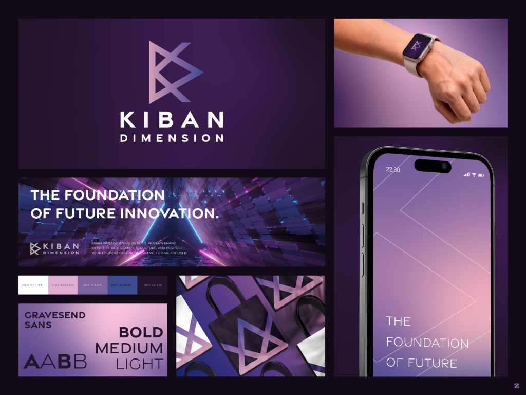
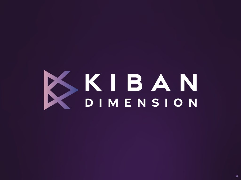
The mark cleverly interlocks the letters “K” and “D” into a single dimensional symbol; the overlapping triangular forms create a sense of depth and perspective, visually representing “dimension” itself. Finished in a clean gradient of soft lavender to deep indigo, the logo carries a sleek, tech-forward feel across every touchpoint.
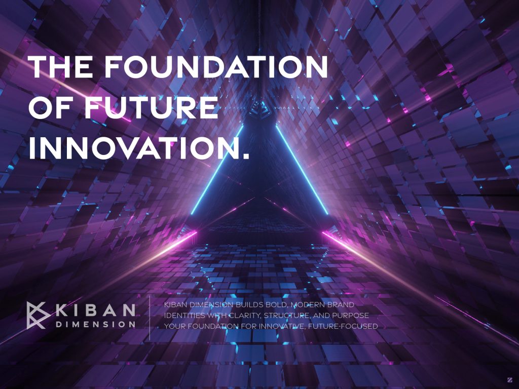
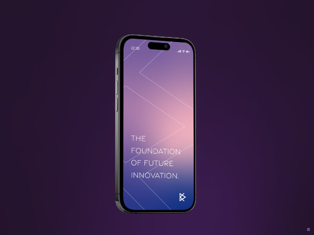
The tagline “The Foundation of Future Innovation” anchors the brand’s voice, positioning Kiban Dimension as infrastructure for what comes next, not just another tech product.
Color System
| Color | Hex | Role |
|---|---|---|
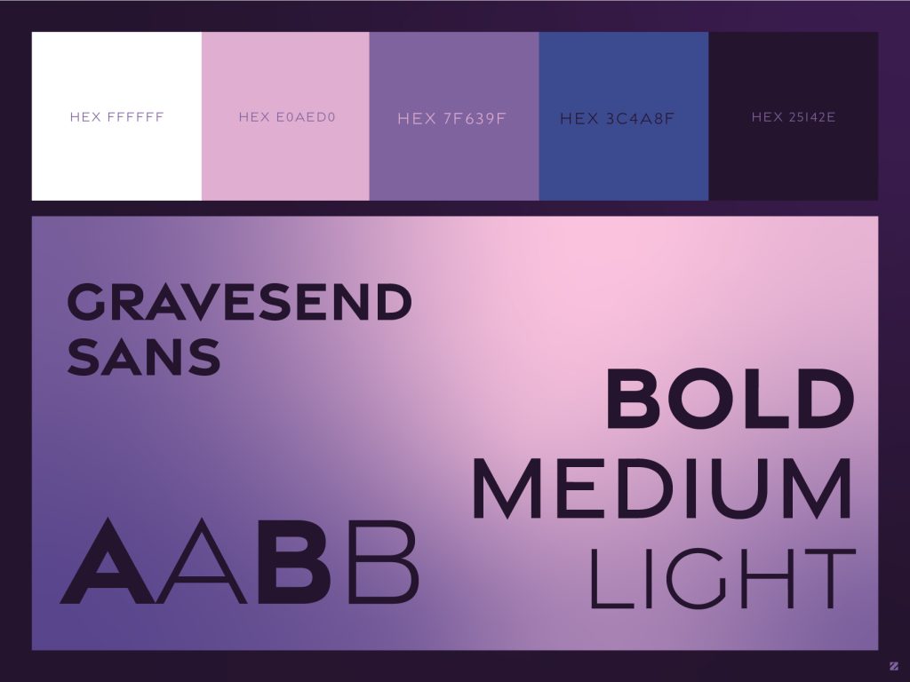
| Soft Lilac | #E0AED0 | Light accent, contrast on dark backgrounds |
| Muted Mauve | #7F639F | Primary – depth, sophistication |
| Indigo Blue | #3C4A8F | Secondary – structure, technical trust |
| Deep Plum | #25142E | Grounding, premium depth |
| White | #FFFFFF | Clarity, breathing room |
The gradient-driven purple palette was chosen specifically to break away from the standard blue/gray tech-brand look, giving Kiban Dimension a more premium, distinctive, and memorable presence in a crowded category.

Typography
Gravesend Sans carries the full identity in Bold, Medium, and Light weights — a versatile geometric sans that keeps the wordmark sharp and technical at large sizes while staying legible and clean in body copy and UI contexts.
Identity System & Deliverables
- Primary logomark + wordmark lockup
- Standalone geometric symbol (app icon / favicon / wearable UI)
- Color palette + usage guidelines
- Typography hierarchy (Gravesend Sans: Bold / Medium / Light)
- Smartwatch UI application
- Mobile app lock-screen / UI application
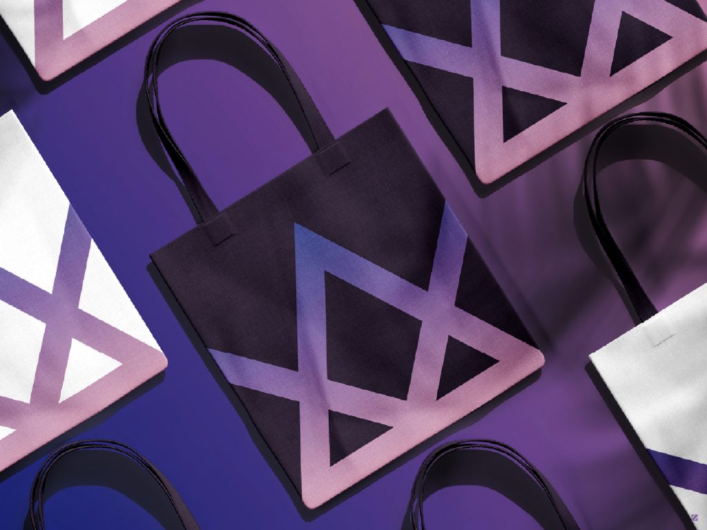
- Merchandise / tote bag application
- Hero brand banner with tagline pairing
Mockup Showcase
To show the brand living beyond a static logo file, I built out a full real-world mockup suite:
- Master Brand Sheet – the full gradient logo lockup on a deep plum background, establishing the core reference point for the identity.
- Hero Brand Banner – the tagline “The Foundation of Future Innovation” paired with an abstract tunnel/grid visual, testing how the brand voice reads against a high-energy, futuristic background.
- Smartwatch UI – the standalone “K” symbol applied to a wearable device screen, testing legibility and clarity at extremely small scale.
- Mobile App Lock Screen – a full gradient UI treatment on a phone screen with the tagline, showing how the brand extends naturally into a digital product experience.
- Merchandise / Tote Bags – the geometric mark repeated across tote bag packaging, testing the brand as a pattern element rather than a single static logo.
- Color & Typography Reference – palette swatches and Gravesend Sans weight samples, forming the foundation of the brand guidelines document.
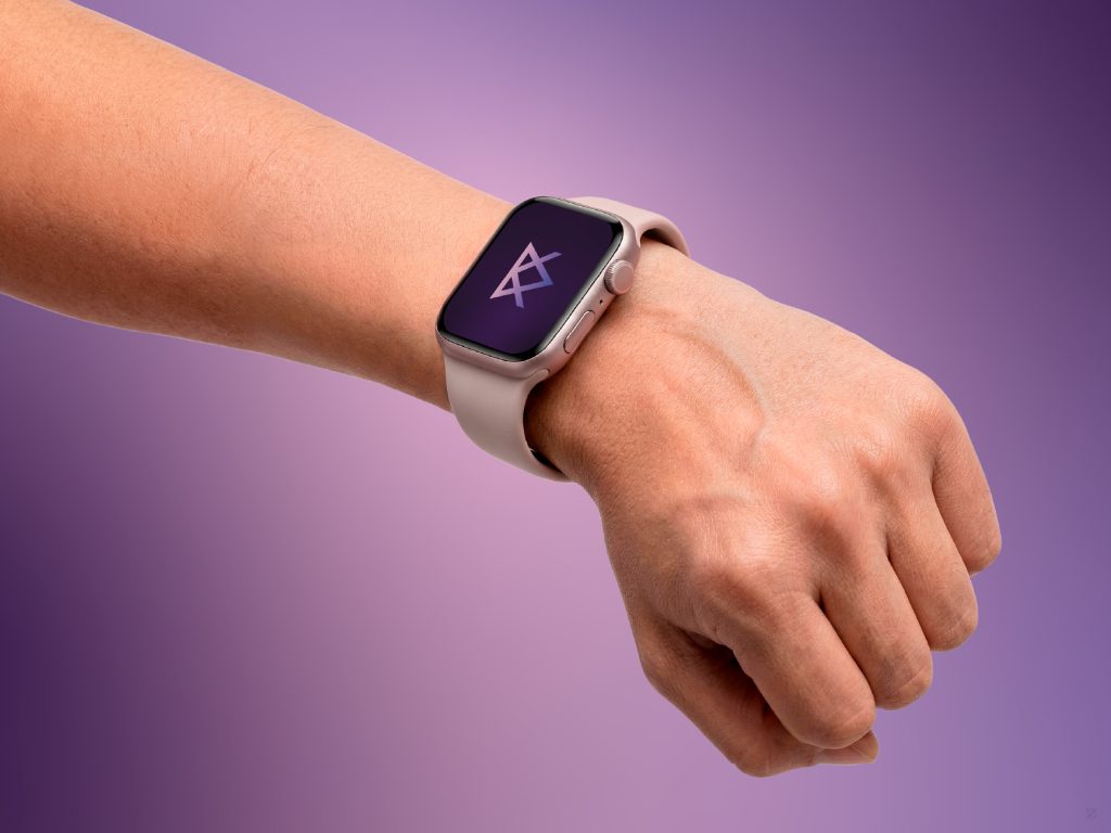
Every mockup was chosen to answer one core question: does this mark still feel sharp, premium, and “dimensional” whether it’s on a 40mm watch face or a room-sized banner? A tech brand that only works in one format isn’t finished yet.
Result
The final identity gives Kiban Dimension a mark that feels genuinely multidimensional flexible enough to move from a smartwatch face to a physical tote bag without losing its structure or premium feel. The “Foundation of Future Innovation” tagline ties the whole system into one coherent, forward-looking brand voice.
Tools Used
Adobe Illustrator · Photoshop · Mockup compositing
Let’s build your brand
We design logo and brand identity systems for tech and innovation driven businesses that want to look premium and future-ready from day one mark, palette, guidelines, and real-world mockups included.