
Aerius – Brand Identity Design
Overview
Aerius is a brand of the future. Modern, forward-looking and built around motion, clarity and elevation. The client needed a full identity system that could scale from an app icon to a large format billboard without losing its energy, something sharp, confident and unmistakably ‘in flight’.
I ran the project from start to finish: brand strategy, logomark design, color and typography system, and a full mockup suite to show the identity in the real world.
Scope Brand strategy · Logo Design · Visual Identity System · Brand Guidelines · Mock-up Presentation
Timeframe: 1 week
Client: Aerius
Industry: SaaS Tech
Aerius Brand Identity Design: The Brief
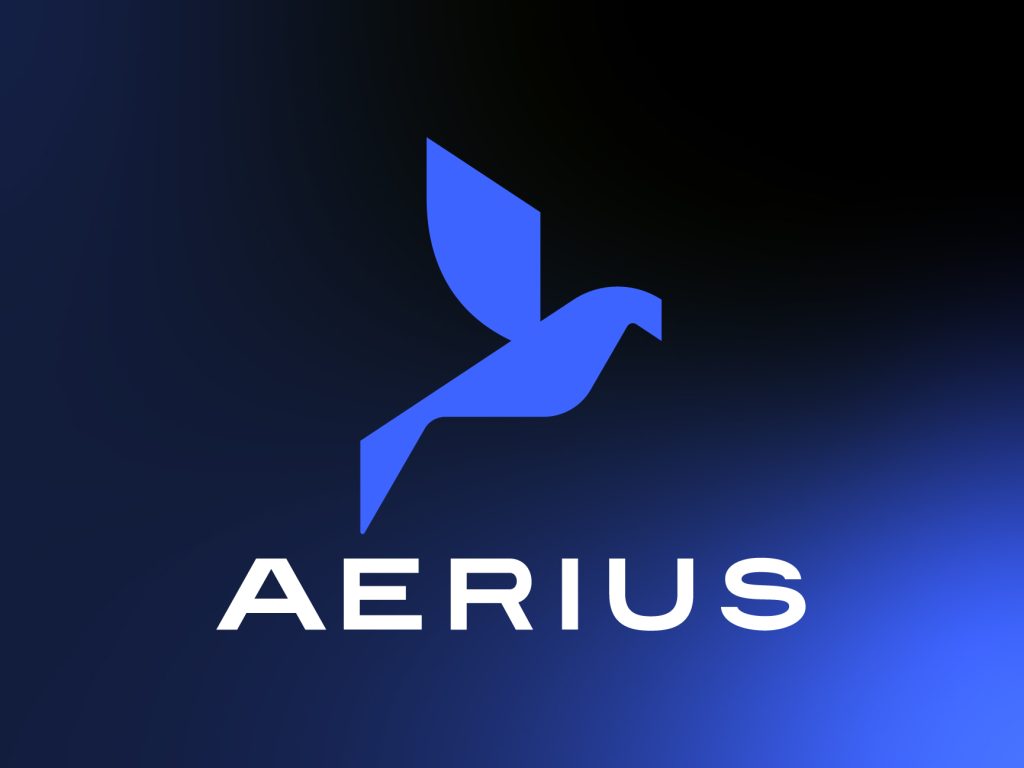
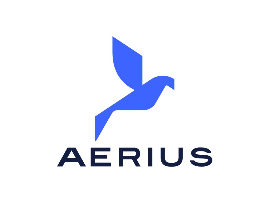
The mark’s focal point is a bird in flight, which has been reduced to distinct, geometric elements rather than a true representation. The negative space and angular wing shapes convey speed and intent, yet the overall silhouette stays immediately recognizable even at small sizes (favicon, app icon, social avatar). “Rise with Purpose” turned into the system’s emotional compass. The campaign mockups, pitch deck, and guidelines all use it to maintain a consistent brand voice.
Key requirements
- A distinctive symbol that works standalone, without the wordmark
- A palette that feels energetic but still professional
- A system flexible enough for digital products, print collateral, signage, and merchandise
- A tagline and voice that reinforce the “elevation” concept
The Concept
The mark centers on a bird in flight distilled into clear, geometric facets, not a literal portrayal. The negative space and angular wing shapes suggest speed and intent, but the overall silhouette remains immediately recognizable even at small sizes (favicon, app icon, social avatar).
“Rise with Purpose” became the emotional anchor for the entire system. It occurs throughout the guidelines, the pitch deck, and the campaign mockups to keep the brand voice consistent wherever it appears.
Color System
| Color | Hex | Role |
| Aerius Blue | #3E64FF | Primary brand color: energy, trust, motion |
| White | #FFFFFF | Clarity, contrast, breathing room |
| Deep Navy | #131E40 | Grounding, depth, premium feel |
The palette is intentionally simple: two anchor colors plus one accent so the brand stays consistent whether it’s on a business card or a 20-foot mall display.
Typography
BINGO A bold, geometric sans-serif carries the wordmark and headlines, giving “AERIUS” a confident, architectural feel in all-caps lockups, while a clean sans handles supporting copy for legibility at smaller sizes.
Identity System & Deliverables
- Primary logomark + wordmark lockup
- Standalone bird symbol (app icon/favicon / social)
- Color palette + usage guidelines
- Typography hierarchy
- Business card system
- Flag / outdoor signage application
- Tote bag/merchandise application
- Mobile app icon + home screen mockup
- Billboard / digital signage (mall/transit) mockup
- Social and pitch-deck style brand slide (“Rise with Purpose”)
Mockup Showcase
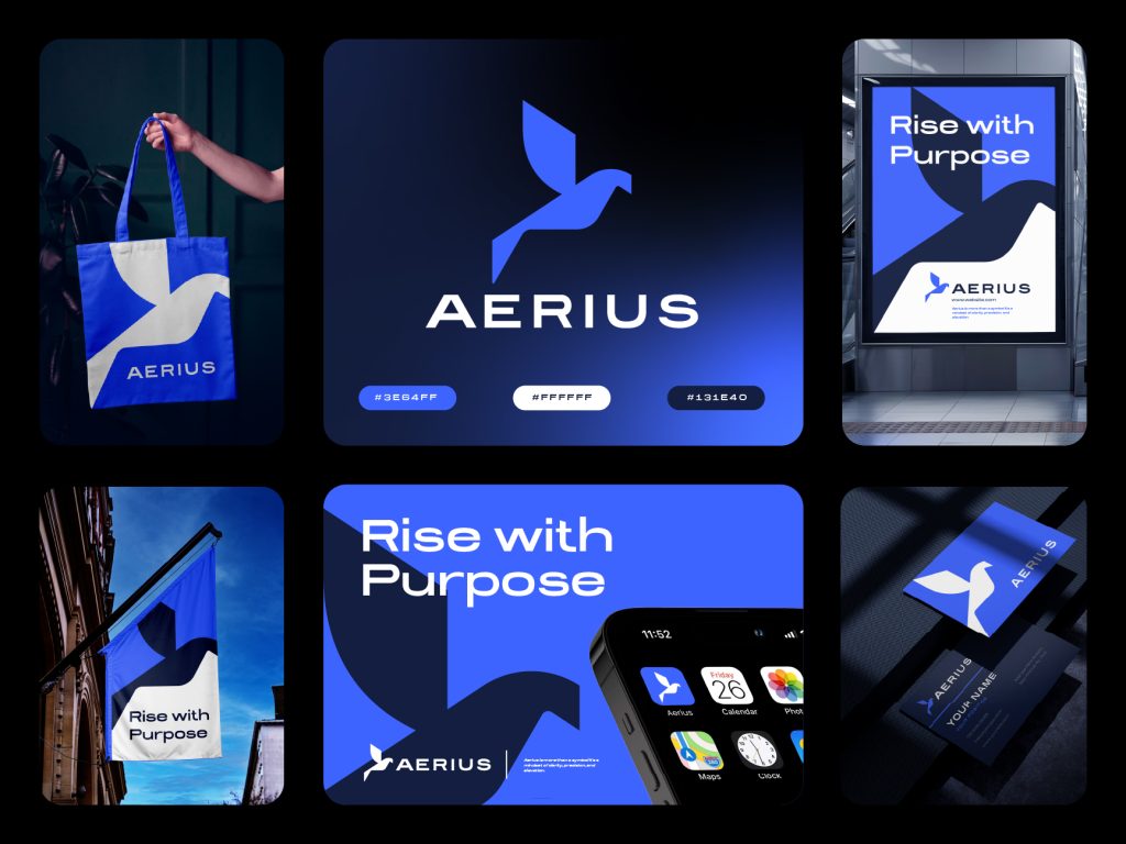
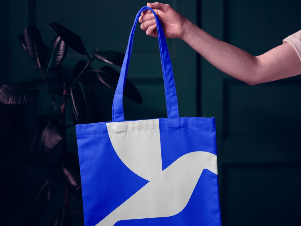
- Tote Bag – the mark split across the bag panel in navy and white on the Aerius Blue field, showing how the symbol holds up when abstracted and cropped.
- Master Brand Sheet – full-color logo lockup on a navy gradient with the three brand hex codes on display, used as the core reference slide in the brand guidelines.
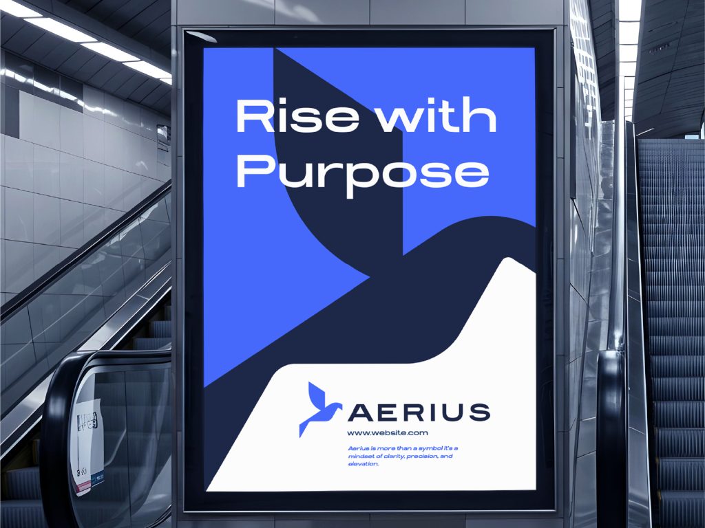
- Outdoor / Transit Signage – a large-format poster mockup in a real environment (escalator/mall setting) to test contrast, visibility, and the tagline pairing at scale.
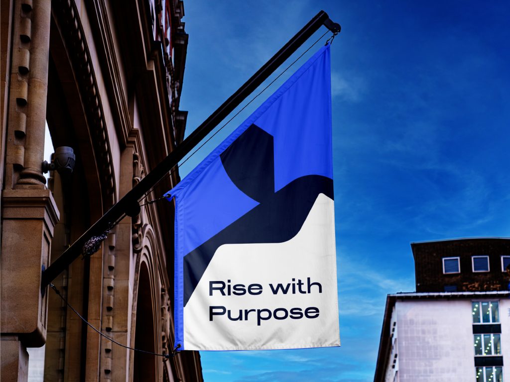
- Flag Application – an exterior building flag mockup showing the mark and tagline reading clearly against open sky, testing the identity in an unconventional format.
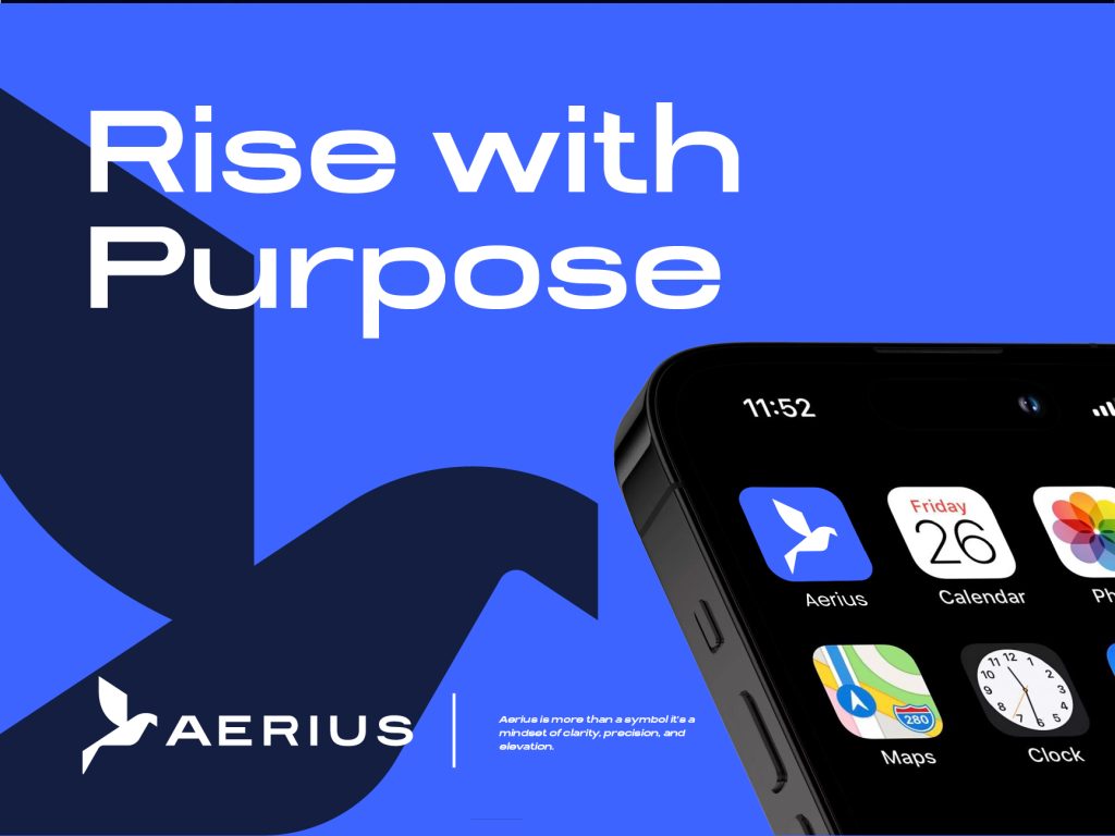
- App + Social Slide – a “Rise with Purpose” headline slide paired with an iPhone home screen mockup showing the Aerius app icon sitting naturally among everyday apps (Calendar, Photos, Maps, Clock).
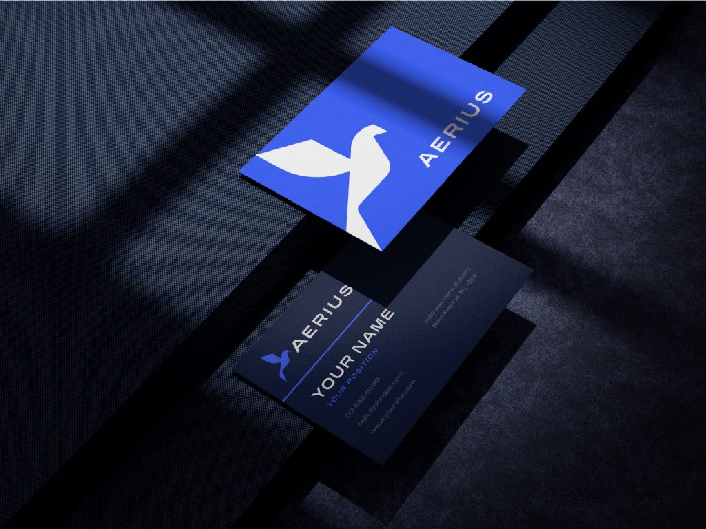
- Business Card System – a two-card layout (icon-only + name/title card) in navy and blue, demonstrating the identity’s flexibility for personal/professional stationery.
Each mockup was chosen deliberately not just to make the logo look nice, but to pressure-test it: Does it hold up in low light? On fabric? At a distance? Cropped? Reversed on dark vs. light? A logo that only looks good in a vacuum isn’t done yet
Result
The final identity gives Aerius a symbol that’s flexible enough to live across digital products, physical retail, and outdoor advertising, while staying instantly recognizable as a single geometric bird mark. The “Rise with Purpose” tagline ties the whole system together into a coherent brand voice, not just a logo.
Tools Used
Adobe Illustrator · Photoshop · Mockup compositing
Let’s build your brand
We design logos and brand identity systems for startups and businesses that want to look premium from day one, with palette, guidelines, and real-world mockups included.